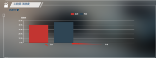
#echarts# 请教下echarts竖形柱状图数据 与 x轴对不齐
 getStatisFactionChart(val) {
      debugger
      const xlChart = this.$echarts.init(document.getElementById('statisChart'))
      xlChart.setOption({
        tooltip: {
          trigger: 'axis',
          axisPointer: {
            type: 'cross',
            crossStyle: {
              color: '#999'
            }
          }
        },
        // toolbox: {
        //   feature: {
        //     dataView: {
        //       show: false,
        //       readOnly: false
        //     },
        //     magicType: {
        //       show: false,
        //       type: ['line', 'bar']
        //     },
        //     restore: {
        //       show: false
        //     },
        //     saveAsImage: {
        //       show: false
        //     }
        //   }
        // },
        legend: {
          data: val.legend,
          textStyle: {
            color: '#FFFFFF'
          }
        },
        xAxis: [{
          type: 'category',
          data: val.xAxis,
          axisPointer: {
            type: 'shadow'
          },
          axisLabel: {
            textStyle: {
              color: '#FFFFFF'
            }
          }
        }],
        yAxis: [{
            type: 'value',
            name: '满意度',
            axisLabel: {
              formatter: '{value} %',
              textStyle: {
                color: '#FFFFFF'
              }
            },
            axisLine: {
              show: true,
              lineStyle: {
                color: '#FFFFFF'
              }
            }
          }
        ],
        series: val.series
      })
    }
  }
官方文档:https://echarts.apache.org/examples/zh/editor.html?c=bar-simple
根据你的数据渲染了一下,你渲染的是并列柱状图。
series: 属性渲染的不对。
数据返回格式:对象(data数组、type字符串)
series:{
        data: [120, 200],
        type: 'bar'
}
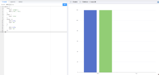
这是传过来的值

去官网找个例子把你的数据带进去试