css画这只熊猫 求代码!!!急
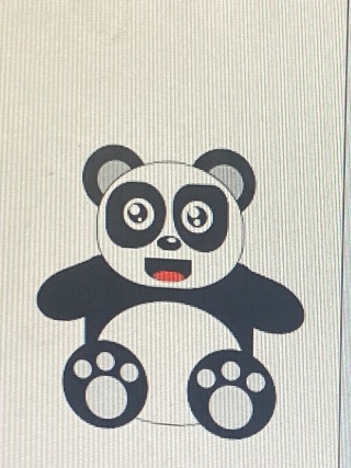
<!DOCTYPE html>
<html>
	<head>
		<meta charset="utf-8">
		<title></title>
	</head>
	<style>
		body {
		  background-color: #e6cff6;
		  text-align:center;
		  height: 100%;
		  margin: 0px;
		}
		#panda{
		  margin: 80px auto;
		  position: relative;
		  height:417px;
		  width:417px;
		}
		#panda div{
			position:absolute;
		}
		#panda div::before, #panda div::after {
		  content:'';
		  position:absolute;
		  display:block;
		}
		.head{
		  z-index:2;
		  width:130px;
		  height:95px;
		  background-color: white;
		  border-radius: 80px 80px 60px 60px;
		  border: 4px solid black;
		  top:85px;
		  left:128px;
		}
		/*nose*/
		.face{
		  z-index: 3;
		  width: 12px;
		  height: 6px;
		  background-color: black;
		  border-radius:100%;
		  top:154px;
		  left: 190px;
		 }
		 /*black part around eyes*/
		 	 /*Left black part of eye*/
		 .eyes::before{
			z-index: 4;
			display:block;
			width: 30px;
			height: 40px;
			top: 115px;
			left: 210px;
			transform: rotate(-20deg);
			background-color: black;
			border-radius: 100% 100% 88% 88% /100% 100% 88% 88%;
		 }
			 /*Right black part of eye*/
		 .eyes::after{
			z-index: 4;
			display:block;
			width: 30px;
			height: 40px;
			top: 115px;
			left: 154px;
			transform: rotate(20deg);
			background-color: black;
			border-radius: 100% 100% 88% 88% /100% 100% 88% 88%;
		 }
		 /*eye balls*/
		 .eye-balls{
		  z-index: 5;
		  width:10px;
		  height:10px;
		  background-color:white;
		  box-shadow: 0 0 0 1px black, 54px 0 0 white, 54px 0 0 1px black;
		  border-radius:100%;
		  top: 125px;
		  left: 164px;
		}
		/*eye shine*/
		.eye-balls::after{
		  z-index: 5;
		  width:3px;
		  height:3px;
		  background-color:white;
		  box-shadow: 0 0 0 1px white, 54px 0 0 white, 54px 0 0 1px white;
		  border-radius:100%;
		  top: 10px;
		  left: 10px;
		}
		.body{
		  z-index: 1;
		  width: 90px;
		  height: 80px;
		  background-color: white;
		  border-top-left-radius: 40%;
			border-top-right-radius: 40%;
			border-bottom-right-radius: 30%;
			border-bottom-left-radius: 30%;
		  border: 4px solid black;
		  top:168px;
		  left:148px;
		}
			/*right ear*/
		.ears::before{
		  width:50px;
		  height:50px;
		  background-color: black;
		  border-radius: 100%;
		  top:90px;
		  left:228px;
		}
			/*left ear*/
		.ears::after{
		  width:50px;
		  height:50px;
		  background-color: black;
		  border-radius: 100%;
		  top:90px;
		  left:117px;
		  }
		 /*beginning of paws*/
		 	/*Bottom paws*/
		.paws{
		  width:26px;
		  height:66px;
		  background-color: black;
		  border-radius:0 0 80px 80px;
		  box-shadow: 50px 0 0 black;
		  top:210px;
		  left:158px;
		}
			/*Top Left paw*/
		.paws::before {
		  z-index: 2;
		  width: 30px;
		  height:34px;
		  background-color: black;
		  border-radius:80px 0px 80px 80px;
		  left:-8px;
		  top:-19px;
		  transform: rotate(-80deg);
		}
			/*Top Right paw*/
		.paws::after {
		  z-index: 2;
		  width: 30px;
		  height:34px;
		  background-color: black;
		  border-radius:0px 80px 80px 80px;
		  left:55px;
		  top:-19px;
		  transform: rotate(80deg);
		}
	</style>
	<body>
		<div id="panda">
		  <div class="head"></div>
		  <div class="face"></div>
		  <div class="eyes"></div>
		  <div class="eye-balls"></div>
		  <div class="body"></div>
		  <div class="paws"></div>
		  <div class="ears"></div>
		</div>
	</body>
</html>
参考这个 https://www.jb51.net/css/643223.html 没有一摸一样的