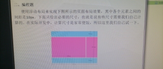
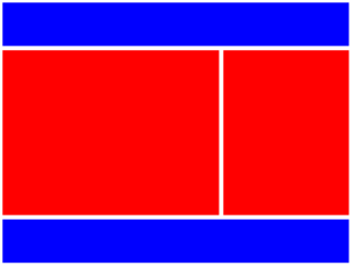
页面布局,各元素间距10px
<!DOCTYPE html>
<html lang="zh">
<head>
	<meta charset="UTF-8">
	<title>Document</title>
	<style>
		.container {
			width: 800px;
			height: 600px;
			float: left;
		}
		.header, .footer {
			width: 800px;
			float: left;
		}
		.header {
			height: 100px;
			margin-bottom: 10px;
			background-color: blue;
		}
		.main-left, .main-right {
			float: left;
			background-color: red;
			height: 380px;
		}
		.main-left {
			width: 500px;
			margin-right: 10px;
		}
		.main-right {
			width: 290px;
		}
		.footer {
			height: 100px;
			margin-top: 10px;
			background-color: blue;
		}
	</style>
</head>
<body>
	<div class="container">
		<div class="header"></div>
		<div class="main-left"></div>
		<div class="main-right"></div>
		<div class="footer"></div>
	</div>
</body>
</html>
如上,满意请采纳哦,谢谢。
主要用到 外边距:margin 浮动:float
<!DOCTYPE html>
<html lang="en">
<head>
    <meta charset="UTF-8">
    <meta name="viewport" content="width=device-width, initial-scale=1.0">
    <meta http-equiv="X-UA-Compatible" content="ie=edge">
    <title>Document</title>

   <style>
       #main{
           width:800px;
           height:600px;
           border:1px solid silver
       }
       .top{
           background-color: deepskyblue;
           height:100px;
       }
       .left{
            float:left;
           width:490px;
           height:400px;
           background-color: fuchsia;
           margin-top:10px
       }
       .right{
           width:300px;
           height:400px;
           background-color: fuchsia;
           float:left;
           margin-top:10px;
           margin-left:10px;
           margin-bottom:10px;
       }
       .bottom{
           clear:both;
           width:800px;
           height:80px;
           background-color: deepskyblue;
       }

   </style>
</head>
<body>
    <div id="main">
        <div class="top">aa</div>
        <div class="left">cc</div>
        <div class="right">dd</div>
        <div class="bottom">dd</div>
    </div>
</body>
</html>
div+flex布局http://www.ruanyifeng.com/blog/2015/07/flex-grammar.html
您好,我是有问必答小助手,您的问题已经有小伙伴解答了,您看下是否解决,可以追评进行沟通哦~
如果有您比较满意的答案 / 帮您提供解决思路的答案,可以点击【采纳】按钮,给回答的小伙伴一些鼓励哦~~
ps:问答VIP仅需29元,即可享受5次/月 有问必答服务,了解详情>>>https://vip.csdn.net/askvip?utm_source=1146287632