wxCharts 柱状图 默认滚动到最后
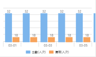
1、创建的时候一个柱状图,默认填入30日考勤数据如下图
2、我想让图生成的时候直接显示30前几天的数据,如下图
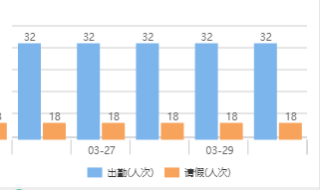
还有就是,为什么数据多了中间的日期 就不显示了呢,如上图没有:03-28?
import * as echarts from '../../ec-canvas/echarts';
let chart = null;
let data = [32, 32, 32, 32, 32, 32, 32, 32, 32, 32, 32, 32, 32, 32, 32, 32, 32, 32, 32, 32, 32, 32, 32, 32, 32, 32, 32, 32, 32, 32, 32]
let data2 = [18,18,18,18,18,18,18,18,18,18,18,18,18,18,18,18,18,18,18,18,18,18,18,18,18,18,18,18,18,18,18]
let categories = ["03-01", "03-02", "03-03", "03-04", "03-05", "03-06", "03-07", "03-08", "03-09", "03-10", "03-11", "03-12", "03-13", "03-14", "03-15", "03-16", "03-17", "03-18", "03-19", "03-20", "03-21", "03-22", "03-23", "03-24", "03-25", "03-26", "03-27", "03-28", "03-29", "03-30", "03-31"]
function initChart(canvas, width, height, dpr) {
chart = echarts.init(canvas, null, {
width: width,
height: height,
devicePixelRatio: dpr // new
});
canvas.setChart(chart);
var option = {
color: ['#37a2da', '#32c5e9', '#67e0e3'],
tooltip: {
trigger: 'axis',
axisPointer: { // 坐标轴指示器,坐标轴触发有效
type: 'shadow' // 默认为直线,可选为:'line' | 'shadow'
},
confine: true
},
legend: {
left: 'center',
bottom: '1%',
data: ['出勤(人次)', '请假(人次)']
},
grid: {
left: 20,
right: 20,
bottom: '7%',
top: 40,
containLabel: true
},
xAxis: [
{
type: 'category',
axisTick: { show: false },
data: categories,
axisLine: {
lineStyle: {
color: '#999'
}
},
axisLabel: {
color: '#666'
}
}
],
yAxis: [
{
type: 'value',
axisLine: {
lineStyle: {
color: '#999'
}
},
axisLabel: {
color: '#666'
}
}
],
dataZoom: [{
type: 'inside',
startValue: categories.length-3,
endValue: categories.length
}],
series: [
{
name: '出勤(人次)',
type: 'bar',
label: {
normal: {
show: true,
position: 'inside'
}
},
data: data,
itemStyle: {
// emphasis: {
// color: '#37a2da'
// }
}
},
{
name: '请假(人次)',
type: 'bar',
stack: '总量',
label: {
normal: {
show: true
}
},
data: data2,
itemStyle: {
// emphasis: {
// color: '#32c5e9'
// }
}
}
]
};
chart.setOption(option);
return chart;
}
Page({
onShareAppMessage: function (res) {
return {
title: 'ECharts 可以在微信小程序中使用啦!',
path: '/pages/index/index',
success: function () { },
fail: function () { }
}
},
data: {
ec: {
onInit: initChart
}
},
onReady() {
// console.log(categories.reverse())
setTimeout(function () {
// 获取 chart 实例的方式
// console.log(chart)
}, 2000);
}
});
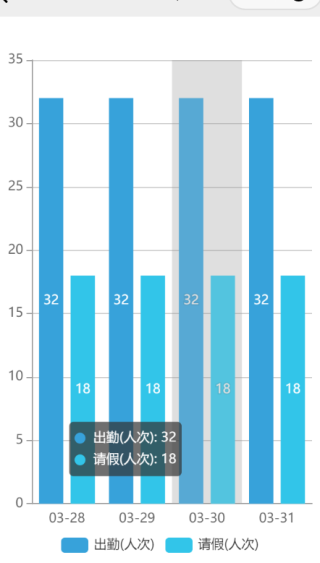
我写了个时间在前的滚动例子,中间日期有不显示是因为x轴标签太多,会自动稀释处理

<view class="container">
<canvas canvas-id="columnCanvas" class="canvas" bindtouchstart="touchHandler" bindtouchmove="moveHandler" bindtouchend="touchEndHandler"></canvas>
</view>
var wxCharts = require('../../../utils/wxcharts.js');
var app = getApp();
var columnChart = null;
var chartData = {
main: {
title: '考勤',
data: [32, 32, 32, 32, 32, 32, 32, 32, 32, 32, 32, 32, 32, 32, 32, 32, 32, 32, 32, 32, 32, 32, 32, 32, 32, 32, 32, 32, 32, 32, 32],
data2:[18,18,18,18,18,18,18,18,18,18,18,18,18,18,18,18,18,18,18,18,18,18,18,18,18,18,18,18,18,18,18],
categories: ['03-31','03-30','03-29','03-28','03-27','03-26','03-25','03-24','03-23','03-22','03-21','03-20','03-19','03-18','03-17','03-16','03-15','03-14','03-13','03-12','03-11','03-10','03-09','03-08','03-07','03-06','03-05','03-04','03-03','03-02','03-01']
}
};
Page({
data: {
isMainChartDisplay: true
},
touchHandler: function (e) {
columnChart.scrollStart(e);
},
moveHandler: function (e) {
columnChart.scroll(e);
},
touchEndHandler: function (e) {
columnChart.scrollEnd(e);
},
onReady: function (e) {
var windowWidth = 320;
try {
var res = wx.getSystemInfoSync();
windowWidth = res.windowWidth;
} catch (e) {
console.error('getSystemInfoSync failed!');
}
columnChart = new wxCharts({
canvasId: 'columnCanvas',
type: 'column',
animation: true,
categories: chartData.main.categories,
series: [{
name: '出勤(人次)',
data: chartData.main.data,
},
{
name: '请假(人次)',
data: chartData.main.data2,
}],
yAxis: {
title: 'hello',
min: 0
},
xAxis: {
disableGrid: false,
type: 'calibration'
},
extra: {
column: {
width: 15
}
},
dataLabel: true,
dataPointShape: true,
enableScroll: true,
width: windowWidth,
height: 200,
});
}
});
<!--index.wxml-->
<view class="container">
<ec-canvas id="mychart-dom-bar" canvas-id="mychart-bar" ec="{{ ec }}"></ec-canvas>
</view>
