css3 +angularjs 如何控制图片滑入滑出?
 , 左下角有一张图片,如何控制点击它,它缓缓从右向左慢慢移除,
然后再从左向右移出另外一张图片或者div内容
.coupon-layer{
background-color:#263646;background-color: rgba(0,0,0,0.5);height: 175px;width: 100%; position: fixed;bottom: 0%; z-index: 12;
.coupon-layer-pic{
width: 980px;height:178px;margin: auto;position: relative;
.coupon-combo{
position: absolute;
top: 15%;
left: 0;
}
bottom-coupon-pic{
transition: all linear 0.5s;
height:294px;
width: 121px;
}
.ng-hide {
width: 0;
}
.coupon-close{
background: url('../svg/close-gray.svg') no-repeat bottom;
position: absolute;
top: 10px;
right: 0px;
cursor: pointer;
}
}
}
<div ng-controller="footLayerCtrl">
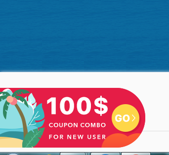
<div class="bottom-coupon" ng-show="isShowCoupon"> <img class="bottom-coupon-pic" ng-click="showCoupon()" src="/dist/images/public/bottom-coupon.png" ></div>
<div class="coupon-layer" ng-show="isShowLayer">
<div class="coupon-layer-pic" >
<a href=""><img class="coupon-combo" src="/dist/images/public/bottom-coupon-expand.png"></a>
<img class="coupon-close" ng-click="closeCoupon()" src="/dist/svg/close-gray.svg" width="30" height="30">
</div>
</div>
</div>
.controller("footLayerCtrl",["$scope","$rootScope","$filter","factoryGlobal","mTranslate", function($scope,$rootScope,$filter,factoryGlobal,mTranslate) {
$scope.isShowCoupon=true;
$scope.isShowLayer=false;
$scope.showCoupon=function () {
$scope.isShowCoupon=false;
$scope.isShowLayer=true;
}
$scope.closeCoupon=function () {
$scope.isShowCoupon=true;
$scope.isShowLayer=false;
}
}])
.bottom-coupon{
  background: url('../images/public/bottom-coupon.png') no-repeat bottom;
  position: fixed;
  bottom: 1%;
  z-index: 12;
  text-align: center;
  cursor: pointer;
  transform: translate3d(0, 0, 0);
  transition: transform 1s ease-in-out;
}
.bottom-coupon-extend{
  .bottom-coupon-1{
    -webkit-animation-delay: 1s;
    -moz-animation-delay: 1s;
    -o-animation-delay: 1s;
    animation-delay: 1s;
    transform: translate3d(-300px, 0, 0);
    transition: transform 0.5s ease-in-out;
  }
  .coupon-layer-1{
    -webkit-animation-delay: 2s;
    -moz-animation-delay: 2s;
    -o-animation-delay: 2s;
    animation-delay: 2s;
    transition: transform 0.5s ease-in-out;
    transform: translate3d(100%, 0, 0);
  }
  .coupon-layer-2{
    animation-delay:2s;
    -webkit-animation-delay:2s; /* Safari 和 Chrome */
    -moz-animation-delay: 2s;
    transition: transform 0.5s ease-in-out;
    transform: translate3d(-100%, 0, 0);
  }
}

.coupon-layer{
  background-color:#263646;background-color: rgba(0,0,0,0.5);height: 175px;width: 100%; position: fixed;bottom: 0%; z-index: 12;
  transition: transform 0.5s ease-in-out;
  transform: translate3d(0, 0, 0);
  .coupon-layer-pic{
    width: 980px;height:178px;margin: auto;position: relative;
    .coupon-combo{
      position: absolute;
      top: 15%;
      left: 0;
    }
    .bottom-coupon-pic{
      transition: all linear 0.5s;
      height:294px;
      width: 121px;
    }
    .ng-hide {
      width: 0;
    }
    .coupon-close{
      background: url('../svg/close-gray.svg') no-repeat bottom;
      position: absolute;
      top: 10px;
      right: 0px;
      cursor: pointer;
    }
  }
}
.fadeIn {
    -webkit-transform : translateX(120px);
   transform : translateX(120px);
   opacity: 1;
}

 .controller("footLayerCtrl",["$scope","$rootScope","$filter","factoryGlobal","mTranslate", function($scope,$rootScope,$filter,factoryGlobal,mTranslate) {
        $scope.showCoupon=function () {
            angular.element(".bottom-coupon").addClass('bottom-coupon-1');
            angular.element(".coupon-layer").removeClass('coupon-layer-1');
            angular.element(".coupon-layer").removeClass('coupon-layer-2');
        }
        $scope.closeCoupon=function () {
            angular.element(".coupon-layer").addClass('coupon-layer-1');
            angular.element(".coupon-layer").addClass('coupon-layer-2');
            angular.element(".bottom-coupon").removeClass('bottom-coupon-1');
        }

    }])


        <div ng-controller="footLayerCtrl" class="bottom-coupon-extend">
        <div class="bottom-coupon "  > <img class="bottom-coupon-pic" ng-click="showCoupon()" src="/dist/images/public/bottom-coupon.png" ></div>
        <div class="coupon-layer coupon-layer-2">
            <div class="coupon-layer-pic" >
                <a href="javascript:void(0)" ng-click="isLogin('/public/user-login.html')"><img class="coupon-combo" src="/dist/images/public/bottom-coupon-expand.png"  ></a>
                <img class="coupon-close" ng-click="closeCoupon()"  src="/dist/svg/close-gray.svg" width="30" height="30">
            </div>
        </div>
    </div>
js 点击元素 从而变更 元素classname
.imag1{
-webkit-animation: imag1 1s forwards;
-moz-animation: imag1 1s forwards;
-ms-animation: imag1 1s forwards;
-o-animation: imag1 1s forwards;
animation: imag1 1s forwards;
}
@-webkit-keyframes imag1 {
1% {
opacity:.8;
margin-left:20px;
}
100% {
opacity:1;
margin-left:0px;
}
}