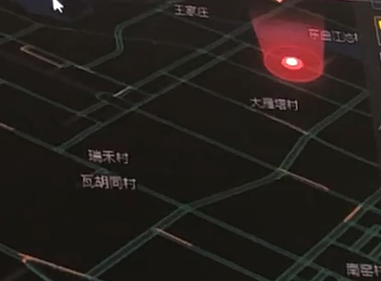
这种立体效果的光柱如果用css3实现
而且此光柱是慢慢从下往上升起来的~
<!doctype html>
<html lang="en">
<head>
    <meta charset="UTF-8" />
    <meta http-equiv="X-UA-Compatible" content="IE=edge,chrome=1" />
    <title> 页面名称 </title>
<style type="text/css">
body {
    background-color: #000;
}
.g {
    margin: 110px 20px 0px 20px;
    width: 100px;
    height: 30px;
    border-radius: 50%;
    background-color: #99f;
    border: 1px solid #f00;
    position: relative;
}
.g:before,.g:after {
    content: "";
    display: block;
    position: absolute;
    left: 0;
    bottom: 0;
    width: 100%;
    height: 0px;
    border-radius: 50%/15px;
    transition: height 1s;
}
.g:before {
    background: radial-gradient(100px 30px at 50% 100%, rgba(255,0,0,0) 80%,rgba(255,0,0,.3) 100%);
    z-index: -1;
}
.g:after {
    background: radial-gradient(100px 30px at 50% 0%, rgba(255,0,0,0) 80%,rgba(255,0,0,.3) 100%);
    z-index: 1;
}
.g:hover:before, .g:hover:after {
    height: 100px;
}

</style>
</head>
<body>
<div class="g"></div>
</body>
</html>
已经很接近了唉,厉害了!!!