为什么是 em 而不是 px?
I heard you should define sizes and distances in your stylesheet with em instead of in pixels. So the question is why should I use em instead of px when defining styles in css? Is there a good example that illustrates this?
转载于:https://stackoverflow.com/questions/609517/why-em-instead-of-px
The reason I asked this question was that I forgot how to use em's as it was a while I was hacking happily in CSS. People didn't notice that I kept the question general as I wasn't talking about sizing fonts per se. I was more interested in how to define styles on any given block element on the page.
As Henrik Paul and others pointed out em is proportional to the font-size used in the element. It's a common practice to define sizes on block elements in px, however, sizing up fonts in browsers usually breaks this design. Resizing fonts is commonly done with the shortcut keys Ctrl++ or Ctrl+-. So a good practice is to use em's instead.
Using px to define the width
Here is an illustrating example. Say we have a div-tag that we want to turn into a stylish date box, we may have HTML-code that looks like this:
<div class="date-box">
    <p class="month">July</p>
    <p class="day">4</p>
</div>
A simple implementation would defining the width of the date-box class in px:
* { margin: 0; padding: 0; }

p.month { font-size: 10pt; }

p.day { font-size: 24pt; font-weight: bold; }

div.date-box {
    background-color: #DD2222;
    font-family: Arial, sans-serif;
    color: white;
    width: 50px;
}
The problem
However, if we want to size the text up in our browser the design will break. The text will also bleed outside the box which is almost the same what happens with SO's design as flodin points out. This is because the box will remain the same size in width as it is locked to 50px.
Using em instead
A smarter way is to define the width in ems instead:
div.date-box {
    background-color: #DD2222;
    font-family: Arial, sans-serif;
    color: white;
    width: 2.5em;
}

* { margin: 0; padding: 0; font-size: 10pt; }

// Initial width of date-box = 10 pt x 2.5 em = 25 pt
// Will also work if you used px instead of pt
That way you have a fluid design on the date-box, i.e. the box will size up together with the text in proportion to the font-size defined for the date-box. In this example, the font-size is defined in * as 10pt and will size up 2.5 times to that font size. So when you're sizing the fonts in the browser, the box will have 2.5 times the size of that font-size.
It's of use for everything that has to scale according to the font size.
It's especially useful on browsers which implement zoom by scaling the font size. So if you size all your elements using em they scale accordingly.
use px for precise placement of graphical elements. use em for measurements having to do positioning and spacing around text elements like line-height etc. px is pixel accurate, em can change dynamically with the font in use
Because the em (http://en.wikipedia.org/wiki/Em_(typography)) is directly proportional to the font size currently in use. If the font size is, say, 16 points, one em is 16 points. If your font size is 16 pixels (note: not the same as points), one em is 16 pixels.
This leads to two (related) things:
- it's easy to keep proportions, if you choose to edit your font sizes in your CSS later on.
- Many browsers support custom font sizes, overriding your CSS. If you design everything in pixels, your layout might break in these cases. But, if you use ems, these overridings should mitigate these problems.
I have a small laptop with a high resolution and have to run Firefox in 120% text zoom to be able to read without squinting.
Many sites have problems with this. The layout becomes all garbled, text in buttons is cut in half or disappears entirely. Even stackoverflow.com suffers from it:
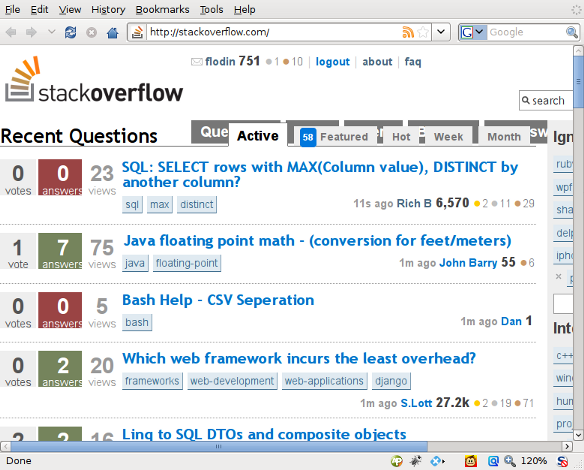
Note how the top buttons and the page tabs overlap. If they would have used em units instead of px, there would not have been a problem.
A very practical reason is that IE 6 doesn't let you resize the font if it's specified using px, whereas it does if you use a relative unit such as em or percentages. Not allowing the user to resize the font is very bad for accessibility. Although it's in decline, there are still a lot of IE 6 users out there.
The main reason for using em or percentages is to allow the user to change the text size without breaking the design. If you design with fonts specified in px, they do not change size (in IE 6 and others) if the user chooses text size - larger. This is very bad for users with visual handicaps.
For several examples of and articles on designs like this (there are a myriad to choose from), see the latest issue of A List Apart: Fluid Grids, the older article How to Size Text in CSS or Dan Cederholm's Bulletproof Web Design.
Your images should still be displayed with px sizes, but, in general, it is not considered good form to size your text with px.
As much as I personally despise IE6, it is currently the only browser approved for the bulk of the users in our Fortune 200 company.
You probably want to use em for font sizes until IE6 is gone (from your site). Px will be alright when page zooming (as opposed to text zooming) becomes the standard behaviour.
Traingamer already provided the neccessary links.
The general consensus is to use percentages for font sizing, because it's more consistent across browsers/platforms.
It's funny though, I always used to use pt for font sizing and I assumed all sites used that. You don't normally use px sizes in other apps (eg Word). I guess it's because they're for printing - but the size is the same in a web browser as in Word...
There is a simple solution if you want to use px to specify font size, but still want the usability that em's provide by placing this in your CSS file:
body {
  font-size: 62.5%;
}
Now specify you p (and other) tags like this:
p {
  font-size: 0.8em; /* This is equal to 8px */
  font-size: 1.0em; /* This is equal to 10px */
  font-size: 1.2em; /* This is equal to 12px */
  font-size: 2.0em; /* This is equal to 20px */
}
And so on.
The top voted answer here from thomasrutter is right in his response about the em. But is very very wrong about the size of a pixel. So even though it is old, I cannot let it be undebated.
A computer screen is normally NOT 96dpi! (Or ppi, if you want to be pedantic.)
A pixel does NOT have a fixed physical size.
(Yes, it is fixed within one screen only, but in the next screen a pixel is most likely bigger, or smaller, and certainly NOT 1/96 of an inch.)
Proof
Draw a line, 960 pixels long. Measure it with a physical ruler. Is it 10 inches? No..?
Connect your laptop to your TV. Is the line 10 inches now? Still not?
Show the line on your iPhone. Still same size? Why not?
Who the heck invented the 96dpi computer screen myth?
(Some religions operate with a 72dpi myth. But equally wrong.)
For what it's worth, here's the definition for the different units in CSS: http://www.w3.org/TR/css3-values/#lengths.
example:
Code: body{font-size:10px;} //keep at 10 all sizes below correct, change this value and the rest change to be e.g. 1.4 of this value
1{font-size:1.2em;} //12px
2{font-size:1.4em;} //14px
3{font-size:1.6em;} //16px
4{font-size:1.8em;} //18px
5{font-size:2em;} //20px
…
body
1
2
3
4
5
by changing the value in body the rest change automatically to be a kind of times the base value…
10×2=20 10×1.6=16 etc
you could have the base value as 8px… so 8×2=16 8×1.6=12.8 //may be rounded by browser