我可以使用哪些 clearfix 方法?
I have the age-old problem of a div wrapping a two-column layout. My sidebar is floated, so my container div fails to wrap the content and sidebar.
<div id="container">
  <div id="content"></div>
  <div id="sidebar"></div>
</div>
There seem to be numerous methods of fixing the clear bug in Firefox:
<br clear="all"/>overflow:autooverflow:hidden
In my situation, the only one that seems to work correctly is the <br clear="all"/> solution, which is a little bit scruffy. overflow:auto gives me nasty scrollbars, and overflow:hidden must surely have side effects. Also, IE7 apparently shouldn't suffer from this problem due to its incorrect behaviour, but in my situation it's suffering the same as Firefox.
Which method currently available to us is the most robust?
转载于:https://stackoverflow.com/questions/211383/what-methods-of-clearfix-can-i-use
Depending upon the design being produced, each of the below clearfix CSS solutions has its own benefits.
The clearfix does have useful applications but it has also been used as a hack. Before you use a clearfix perhaps these modern css solutions can be useful:
Modern Clearfix Solutions
Container with overflow: auto;
The simplest way to clear floated elements is using the style overflow: auto on the containing element. This solution works in every modern browsers.
<div style="overflow: auto;">
  <img
    style="float: right;"
    src="path/to/floated-element.png"
    width="500"
    height="500"
  >
  <p>Your content here…</p>
</div>
One downside, using certain combinations of margin and padding on the external element can cause scrollbars to appear but this can be solved by placing the margin and padding on another parent containing element.
Using ‘overflow: hidden’ is also a clearfix solution, but will not have scrollbars, however using hidden will crop any content positioned outside of the containing element.
Note: The floated element is an img tag in this example, but could be any html element.
Clearfix Reloaded
Thierry Koblentz on CSSMojo wrote: The very latest clearfix reloaded. He noted that by dropping support for oldIE, the solution can be simplified to one css statement. Additionally, using display: block (instead of display: table) allows margins to collapse properly when elements with clearfix are siblings.
.container::after {
  content: "";
  display: block;
  clear: both;
}
This is the most modern version of the clearfix.
⋮
⋮
Older Clearfix Solutions
The below solutions are not necessary for modern browsers, but may be useful for targeting older browsers.
Note that these solutions rely upon browser bugs and therefore should be used only if none of the above solutions work for you.
They are listed roughly in chronological order.
"Beat That ClearFix", a clearfix for modern browsers
Thierry Koblentz' of CSS Mojo has pointed out that when targeting modern browsers, we can now drop the zoom and ::before property/values and simply use:
.container::after {
    content: "";
    display: table;
    clear: both;
}
This solution does not support for IE 6/7 …on purpose!
Thierry also offers: "A word of caution: if you start a new project from scratch, go for it, but don’t swap this technique with the one you have now, because even though you do not support oldIE, your existing rules prevent collapsing margins."
Micro Clearfix
The most recent and globally adopted clearfix solution, the Micro Clearfix by Nicolas Gallagher.
Known support: Firefox 3.5+, Safari 4+, Chrome, Opera 9+, IE 6+
.container::before, .container::after {
  content: "";
  display: table;
}
.container::after {
  clear: both;
}
.container {
  zoom: 1;
}
Overflow Property
This basic method is preferred for the usual case, when positioned content will not show outside the bounds of the container.
http://www.quirksmode.org/css/clearing.html - explains how to resolve common issues related to this technique, namely, setting width: 100% on the container.
.container {
  overflow: hidden;
  display: inline-block;
  display: block;
}
Rather than using the display property to set "hasLayout" for IE, other properties can be used for triggering "hasLayout" for an element.
.container {
  overflow: hidden;
  zoom: 1;
  display: block;
}
Another way to clear floats using the overflow property is to use the underscore hack. IE will apply the values prefixed with the underscore, other browsers will not. The zoom property triggers hasLayout in IE:
.container {
  overflow: hidden;
  _overflow: visible; /* for IE */
  _zoom: 1; /* for IE */
}
While this works... it is not ideal to use hacks.
PIE: Easy Clearing Method
This older "Easy Clearing" method has the advantage of allowing positioned elements to hang outside the bounds of the container, at the expense of more tricky CSS.
This solution is quite old, but you can learn all about Easy Clearing on Position Is Everything: http://www.positioniseverything.net/easyclearing.html
Element using "clear" property
The quick and dirty solution (with some drawbacks) for when you’re quickly slapping something together:
<br style="clear: both" /> <!-- So dirty! -->
Drawbacks
- It's not responsive and thus may not provide the desired effect if layout styles change based upon media queries. A solution in pure CSS is more ideal.
- It adds html markup without necessarily adding any semantic value.
- It requires a inline definition and solution for each instance rather than a class reference to a single solution of a “clearfix” in the css and class references to it in the html.
- It makes code difficult to work with for others as they may have to write more hacks to work around it.
- In the future when you need/want to use another clearfix solution, you won't have to go back and remove every
<br style="clear: both" />tag littered around the markup.
I've found a bug in the official CLEARFIX-Method: The DOT doesn't have a font-size. And if you set the height = 0 and the first Element in your DOM-Tree has the class "clearfix" you'll allways have a margin at the bottom of the page of 12px :)
You have to fix it like this:
/* float clearing for everyone else */
.clearfix:after{
  clear: both;
  content: ".";
  display: block;
  height: 0;
  visibility: hidden;
  font-size: 0;
}
It's now part of the YAML-Layout ... Just take a look at it - it's very interesting! http://www.yaml.de/en/home.html
The overflow property can be used to clear floats with no additional mark-up:
.container { overflow: hidden; }
This works for all browsers except IE6, where all you need to do is enable hasLayout (zoom being my preferred method):
.container { zoom: 1; }
I recommend using the following, which is taken from http://html5boilerplate.com/
/* >> The Magnificent CLEARFIX << */
.clearfix:after {
  content: ".";
  display: block;
  height: 0;
  clear: both;
  visibility: hidden;
}
.clearfix {
  display: inline-block;
}
* html .clearfix {
  height: 1%;
} /* Hides from IE-mac \*/
.clearfix {
  display: block;
}
I just use :-
.clear:after{
  clear: both;
  content: "";
  display: block;
}
Works best and compatible with IE8+ :)
This is quite a tidy solution:
/* For modern browsers */
.cf:before,
.cf:after {
    content:"";
    display:table;
}

.cf:after {
    clear:both;
}

/* For IE 6/7 (trigger hasLayout) */
.cf {
    zoom:1;
}
It's known to work in Firefox 3.5+, Safari 4+, Chrome, Opera 9+, IE 6+
Including the :before selector is not necessary to clear the floats, but it prevents top-margins from collapsing in modern browsers. This ensures that there is visual consistency with IE 6/7 when zoom:1 is applied.
What problems are we trying to solve?
There are two important considerations when floating stuff:
Containing descendant floats. This means that the element in question makes itself tall enough to wrap all floating descendants. (They don't hang outside.)
Insulating descendants from outside floats. This means that descendants inside of an element should be able to use
clear: bothand have it not interact with floats outside the element.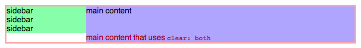
Block formatting contexts
There's only one way to do both of these. And that is to establish a new block formatting context. Elements that establish a block formatting context are an insulated rectangle in which floats interact with each other. A block formatting context will always be tall enough to visually wrap its floating descendants, and no floats outside of a block formatting context may interact with elements inside. This two-way insulation is exactly what you want. In IE, this same concept is called hasLayout, which can be set via zoom: 1.
There are several ways to establish a block formatting context, but the solution I recommend is display: inline-block with width: 100%. (Of course, there are the usual caveats with using width: 100%, so use box-sizing: border-box or put padding, margin, and border on a different element.)
The most robust solution
Probably the most common application of floats is the two-column layout. (Can be extended to three columns.)
First the markup structure.
<div class="container">
  <div class="sidebar">
    sidebar<br/>sidebar<br/>sidebar
  </div>
  <div class="main">
    <div class="main-content">
      main content
      <span style="clear: both">
        main content that uses <code>clear: both</code>
      </span>
    </div>
  </div>
</div>
And now the CSS.
/* Should contain all floated and non-floated content, so it needs to
 * establish a new block formatting context without using overflow: hidden.
 */
.container {
  display: inline-block;
  width: 100%;
  zoom: 1; /* new block formatting context via hasLayout for IE 6/7 */
}

/* Fixed-width floated sidebar. */
.sidebar {
  float: left;
  width: 160px;
}

/* Needs to make space for the sidebar. */
.main {
  margin-left: 160px;
}

/* Establishes a new block formatting context to insulate descendants from
 * the floating sidebar. */
.main-content {
  display: inline-block;
  width: 100%;
  zoom: 1; /* new block formatting context via hasLayout for IE 6/7 */
}
Try it yourself
Go to JS Bin to play around with the code and see how this solution is built from the ground up.
Traditional clearfix methods considered harmful
The problem with the traditional clearfix solutions is that they use two different rendering concepts to achieve the same goal for IE and everyone else. In IE they use hasLayout to establish a new block formatting context, but for everyone else they use generated boxes (:after) with clear: both, which does not establish a new block formatting context. This means things won't behave the same in all situations. For an explanation of why this is bad, see Everything you Know about Clearfix is Wrong.
The new standard, as used by Inuit.css and Bourbon - two very widely used and well-maintained CSS/Sass frameworks:
.btcf:after {
    content:"";
    display:block;
    clear:both;
}
Notes
Keep in mind that clearfixes are essentially a hack for what flexbox layouts can now provide in a much smarter way. CSS floats were originally designed for inline content to flow around - like images in a long textual article - and not for grid layouts and the like. If your target browsers support flexbox, it's worth looking into.
This doesn't support IE7. You shouldn't be supporting IE7. Doing so continues to expose users to unfixed security exploits and makes life harder for all other web developers, as it reduces the pressure on users and organisations to switch to modern browsers.
This clearfix was announced and explained by Thierry Koblentz in July 2012. It sheds unnecessary weight from Nicolas Gallagher's 2011 micro-clearfix. In the process, it frees a pseudo-element for your own use. This has been updated to use display: block rather than display: table (again, credit to Thierry Koblentz).