如何垂直对齐图像内部的一个 div?
Question
How can you align an image inside of a containing div?
Example
In my example, I need to vertically center the <img> in the <div> with class ="frame" :
<div class="frame" style="height: 25px;">
    <img src="http://jsfiddle.net/img/logo.png" />
</div>
.frame's height is fixed and image's height is unknown. I can add new elements in .frame if that's the only solution. I'm trying to do this on IE≥7, Webkit, Gecko.
See the jsfiddle here
.frame {
    height: 25px;      /* equals max image height */
    line-height: 25px;
    width: 160px;
    border: 1px solid red;

    text-align: center; margin: 1em 0;
}
img {
    background: #3A6F9A;
    vertical-align: middle;
    max-height: 25px;
    max-width: 160px;
}
<div class=frame>
   <img src="http://jsfiddle.net/img/logo.png" height=250 />
</div>
<div class=frame>
   <img src="http://jsfiddle.net/img/logo.png" height=25 />
</div>
<div class=frame>
   <img src="http://jsfiddle.net/img/logo.png" height=23 />
</div>
<div class=frame>
   <img src="http://jsfiddle.net/img/logo.png" height=21 />
</div>
<div class=frame>
   <img src="http://jsfiddle.net/img/logo.png" height=19 />
</div>
<div class=frame>
    <img src="http://jsfiddle.net/img/logo.png" height=17 />
</div>
<div class=frame>
    <img src="http://jsfiddle.net/img/logo.png" height=15 />
 </div>
<div class=frame>
    <img src="http://jsfiddle.net/img/logo.png" height=13 />
 </div>
<div class=frame>
    <img src="http://jsfiddle.net/img/logo.png" height=11 />
 </div>
<div class=frame>
    <img src="http://jsfiddle.net/img/logo.png" height=9 />
 </div>
<div class=frame>
    <img src="http://jsfiddle.net/img/logo.png" height=7 />
 </div>
<div class=frame>
    <img src="http://jsfiddle.net/img/logo.png" height=5 />
 </div>
<div class=frame>
    <img src="http://jsfiddle.net/img/logo.png" height=3 />
 </div>
</div>
转载于:https://stackoverflow.com/questions/7273338/how-to-vertically-align-an-image-inside-a-div
The only (and the best cross-browser) way as I know is to use an inline-block helper with height: 100% and vertical-align: middle on both elements.
So there is a solution: http://jsfiddle.net/kizu/4RPFa/4570/
.frame {
    height: 25px;      /* equals max image height */
    width: 160px;
    border: 1px solid red;
    white-space: nowrap; /* this is required unless you put the helper span closely near the img */

    text-align: center; margin: 1em 0;
}

.helper {
    display: inline-block;
    height: 100%;
    vertical-align: middle;
}

img {
    background: #3A6F9A;
    vertical-align: middle;
    max-height: 25px;
    max-width: 160px;
}
<div class="frame">
<span class="helper"></span><img src="http://jsfiddle.net/img/logo.png" height=250px />
</div>
<div class="frame">
<span class="helper"></span><img src="http://jsfiddle.net/img/logo.png" height=25px />
</div>
<div class="frame">
<span class="helper"></span><img src="http://jsfiddle.net/img/logo.png" height=23px />
</div>
<div class="frame">
<span class="helper"></span><img src="http://jsfiddle.net/img/logo.png" height=21px />
</div>
<div class="frame">
<span class="helper"></span><img src="http://jsfiddle.net/img/logo.png" height=19px />
</div>
<div class="frame">
<span class="helper"></span>
<img src="http://jsfiddle.net/img/logo.png" height=17px />
</div>
<div class="frame">
<span class="helper"></span>
<img src="http://jsfiddle.net/img/logo.png" height=15px />
</div>
<div class="frame">
<span class="helper"></span>
<img src="http://jsfiddle.net/img/logo.png" height=13px />
</div>
<div class="frame">
<span class="helper"></span>
<img src="http://jsfiddle.net/img/logo.png" height=11px />
</div>
<div class="frame">
<span class="helper"></span>
<img src="http://jsfiddle.net/img/logo.png" height=9px />
</div>
<div class="frame">
<span class="helper"></span>
<img src="http://jsfiddle.net/img/logo.png" height=7px />
</div>
<div class="frame">
<span class="helper"></span>
<img src="http://jsfiddle.net/img/logo.png" height=5px />
</div>
<div class="frame">
<span class="helper"></span>
<img src="http://jsfiddle.net/img/logo.png" height=3px />
</div>Or, if you don't want to have an extra element in modern browsers and don't mind using IE expressions, you can use a pseudo-element and add it to IE using a convenient Expression, that runs only once per element, so there won't be any performance issues:
The solution with :before and expression() for IE: http://jsfiddle.net/kizu/4RPFa/4571/
.frame {
    height: 25px;      /* equals max image height */
    width: 160px;
    border: 1px solid red;
    white-space: nowrap;

    text-align: center; margin: 1em 0;
}

.frame:before,
.frame_before {
    content: "";
    display: inline-block;
    height: 100%;
    vertical-align: middle;
}

img {
    background: #3A6F9A;
    vertical-align: middle;
    max-height: 25px;
    max-width: 160px;
}

/* Move this to conditional comments */
.frame {
    list-style:none;
    behavior: expression(
        function(t){
            t.insertAdjacentHTML('afterBegin','<span class="frame_before"></span>');
            t.runtimeStyle.behavior = 'none';
        }(this)
    );
}
<div class="frame"><img src="http://jsfiddle.net/img/logo.png" height=250px /></div>
<div class="frame"><img src="http://jsfiddle.net/img/logo.png" height=25px /></div>
<div class="frame"><img src="http://jsfiddle.net/img/logo.png" height=23px /></div>
<div class="frame"><img src="http://jsfiddle.net/img/logo.png" height=21px /></div>
<div class="frame"><img src="http://jsfiddle.net/img/logo.png" height=19px /></div>
<div class="frame"><img src="http://jsfiddle.net/img/logo.png" height=17px /></div>
<div class="frame"><img src="http://jsfiddle.net/img/logo.png" height=15px /></div>
<div class="frame"><img src="http://jsfiddle.net/img/logo.png" height=13px /></div>
<div class="frame"><img src="http://jsfiddle.net/img/logo.png" height=11px /></div>
<div class="frame"><img src="http://jsfiddle.net/img/logo.png" height=9px /></div>
<div class="frame"><img src="http://jsfiddle.net/img/logo.png" height=7px /></div>
<div class="frame"><img src="http://jsfiddle.net/img/logo.png" height=5px /></div>
<div class="frame"><img src="http://jsfiddle.net/img/logo.png" height=3px /></div>How it works:
When you have two
inline-blockelements near each other, you can align each to other's side, so withvertical-align: middleyou'll get something like this:
When you have a block with fixed height (in
px,emor other absolute unit), you can set the height of inner blocks in%.- So, adding one
inline-blockwithheight: 100%in a block with fixed height would align anotherinline-blockelement in it (<img/>in your case) vertically near it.
</div>
This works for modern browsers (2016 at time of edit) as shown in this demo on codepen
.frame {
    height: 25px;
    line-height: 25px;
    width: 160px;
    border: 1px solid #83A7D3;
}
.frame img {
    background: #3A6F9A;
    display:inline-block;
    vertical-align: middle;
}
It is very important that you either give the images a class or use inheritance to target the images that you need centered. In this example we used .frame img {} so that only images wrapped by a div with a class of .frame would be targeted.
Background image solution I removed the image element all together and set it as background of the div with a class of .frame
this at least works fine on IE8, FF6 and Chrome13
I checked, this solution will not work to shrink images larger then 25px height. There is a property called background-size which does set the size of the element, but it is CSS3 which would conflict with IE7 requirement.
I wouldd advice you to either redo your browser priorities and design for the best available browsers, or get some serverside code to resize the images if you'd want to use this solution
You could do this:
demo
CSS
.frame {
    height: 25px;      /* equals max image height */
    line-height: 25px;
    width: 160px;
    border: 1px solid red;

    text-align: center; margin: 1em 0;
    position: relative; /* Changes here... */
}
img {
    background: #3A6F9A;
    max-height: 25px;
    max-width: 160px;
    top: 50%;           /* here.. */
    left: 50%;           /* here... */
    position: absolute; /* and here */
}
javascript
$("img").each(function(){
    this.style.marginTop = $(this).height() / -2 + "px";
})
.frame {
    height: 35px;      /* equals max image height */
    width: 160px;
    border: 1px solid red;
    text-align: center;
    margin: 1em 0;
    display: table-cell;
    vertical-align: middle;
}
img {
    background: #3A6F9A;
    display: block;
    max-height: 35px;
    max-width: 160px;
}
The key property is display: table-cell; for .frame. Div.frame is displayed as inline with this, so you need to wrap it in a block element.
This works in FF, Opera, Chrome, Safari and IE8+.
UPDATE
For IE7 we need to add a css expression:
*:first-child+html img {
    position: relative;
    top: expression((this.parentNode.clientHeight-this.clientHeight)/2+"px");
}
A PURE CSS Solution:
The CSS:
.frame {
    margin: 1em 0;
    height: 35px;
    width: 160px;
    border: 1px solid red;
    position: relative;
}
img {
    max-height: 25px;
    max-width: 160px;
    position: absolute;
    top: 0;
    bottom: 0;
    left: 0;
    right: 0;
    margin: auto;
    background: #3A6F9A;
}
Key stuff
// position: relative; - in .frame holds the absolute element within the frame
// top: 0; bottom: 0; left: 0; right: 0; - this is key for centering a component
// margin: auto; - centers the image horizontally & vertically
Try this solution with with pure css http://jsfiddle.net/sandeep/4RPFa/72/ May be the main problem with your html. Your not use quote when you define class & image height in your html.
CSS:
.frame {
    height: 25px;      /* equals max image height */
    width: 160px;
    border: 1px solid red;
    position:relative;
    margin: 1em 0;
    top: 50%;
    text-align: center;
    line-height: 24px;
    margin-bottom:20px;
}

img {
    background: #3A6F9A;
    vertical-align: middle;
    line-height:0;
    margin:0 auto;
    max-height:25px;
}
EDIT :
When i work around with the img tag it's leave 3px to 2px space from top. Now i decrease line-height & it's work. css:
    .frame {
        height: 25px;      /* equals max image height */
        width: 160px;
        border: 1px solid red;
        margin: 1em 0;
        text-align: center;
        line-height:22px;
        *:first-child+html line-height:24px; /* for IE7 */
    }

    img {
        background: #3A6F9A;
        vertical-align: middle;
        line-height:0;
        max-height:25px;
        max-width:160px;
    }
@media screen and (-webkit-min-device-pixel-ratio:0) {
    .frame {
        line-height:20px; /* webkit browsers */
    }
the line-height property is render differently in different browsers. So; we have to define different line-height property browsers
Check this example http://jsfiddle.net/sandeep/4be8t/11/
Check this example about line-height different in different browsers input height differences in Firefox and Chrome
You could try setting the CSS of PI to display: table-cell; vertical-align: middle;
If you can live with pixel-sized margins, just add font-size: 1px; to the .frame. But remember, that now on the .frame 1em = 1px, which means, you need to set the margin in pixels too.
http://jsfiddle.net/feeela/4RPFa/96/
EDIT: now its not centered anymore in Opera…
This might be useful:
div {
    position:relative;
    width:200px;
    height:200px;
}
img {
    position:absolute;
    top:0;
    bottom:0;
    margin:auto;
}
.image {
    min-height:50px
}
Reference : http://www.student.oulu.fi/~laurirai/www/css/middle/
I had the same problem. This works for me:
<style type="text/css">
div.parent {
     position: relative;
}

img.child {
    bottom: 0;
    left: 0;
    margin: auto;
    position: absolute;
    right: 0;
    top: 0;
}
</style>

<div class="parent">
    <img class="child">
</div>
My solution: http://jsfiddle.net/XNAj6/2/
<div class="container">
    <div class="frame">
        <img src="http://jsfiddle.net/img/logo.png" class="img" alt="" />
    </div>
</div>

.container {
    display: table;
    float: left;
    border: solid black 1px;
    margin: 2px;
    padding: 0;
    background-color: black;
    width: 150px;
    height: 150px;
}
.frame {
    display: table-cell;
    text-align: center;
    vertical-align: middle;
    border-width: 0;
}
.img {
    max-width: 150px;
    max-height: 150px;
    vertical-align: middle;
}
matejkramny's solution is a good start, but oversized images have a wrong ratio.
Here's my fork:
demo: https://jsbin.com/lidebapomi/edit?html,css,output
HTML:
<div class="frame">
  <img src="foo"/>
</div>
CSS:
.frame {
    height: 160px; /*can be anything*/
    width: 160px; /*can be anything*/
    position: relative;
}
img {
    max-height: 100%;
    max-width: 100%;
    width: auto;
    height: auto;
    position: absolute;
    top: 0;
    bottom: 0;
    left: 0;
    right: 0;
    margin: auto;
}
This way you can center an image vertically (demo):
div{
  height:150px; //IE7fix
  line-height: 150px;
}
img{
  vertical-align: middle;
  margin-bottom:0.25em;
}
Not sure about IE, but under Firefox and Chrome, if you have a img in a div container, the following css should work. At least for me works well:
div.img-container {
    display:table-cell;
    vertical-align: middle;
    height: 450px;
    width: 490px;
}

div.img-container img {
    max-height: 450px;
    max-width: 490px;
}
The old JSFiddle link I posted here didnt work anymore, thats probably the reason for the downvote. Just for the sake of this being a valid answer i still want to post the jQuery solution again. This works for every element that has the v_align class applied to it. It will be vertical centered in the parent and on resizing of the window it will be recalculated.
$(document).ready(function() {
  // define the class that vertial aligns stuff
  var objects = '.v_align';
  // initial setup
  verticalAlign(objects);

  // register resize event listener
  $(window).resize(function() {
    verticalAlign(objects);
  });
});

function verticalAlign(selector) {
  $(selector).each(function(val) {
    var parent_height = $(this).parent().height();
    var dif = parent_height - $(this).height()
    // should only work if the parent is larger than the element
    var margin_top = dif > 0 ? dif/2 : 0;
    $(this).css("margin-top", margin_top + "px");
  });
}
The best solution is that
.block{
    /* decor */
    padding:0 20px;
    background:#666;
    border:2px solid #fff;
    text-align:center;
    /* important */
    min-height:220px;
    width:260px;
    white-space:nowrap;
}
.block:after{
    content:'';
    display:inline-block;
    height:220px; /* the same as min-height */
    width:1px;
    overflow:hidden;
    margin:0 0 0 -5px;
    vertical-align:middle;
}
.block span{
    vertical-align:middle;
    display:inline-block;
    white-space:normal;
}
3 line solution:
position: relative;
top: 50%;
transform: translateY(-50%);
This applies to anything.
From here.
Easy way which work for me:
img {
    vertical-align: middle;
    display: inline-block;
    position: relative;
}
Works for Google Chrome very well. Try this one out on different browser.
I have been playing around with using padding for center alignment. You will need to define the top level outer-container size, but the inner container should resize, and you can set the padding at different percentage values.
<div class='container'>
  <img src='image.jpg' />
</div>

.container {
  padding: 20%;
  background-color: blue;
}

img {
  width: 100%;
}
For those that landed on this post and are interested in a more modern solution, and that have no need to support legacy browsers, you can do this:
.frame {
    display: flex;
    /*Uncomment below to center horizontally*/
    /*justify-content: center;*/
    align-items: center;
}

img {
    height: auto;
}

/* Styling stuff not needed for demo */
.frame {
    max-width: 900px;
    height: 200px;
    margin: auto;
    background: #222;
}
p {
    max-width: 900px;
    margin: 20px auto 0;
}
img {
    width: 150px;
}
<div class="frame">
<img src="https://s3-us-west-2.amazonaws.com/s.cdpn.io/9988/hand-pointing.png">
</div>Here's a Pen: http://codepen.io/ricardozea/pen/aa0ee8e6021087b6e2460664a0fa3f3e
</div>
There is a super easy solution with flexbox!
.frame {
    display: flex;
    align-items: center;
}
You can try below code
.frame{
 display:flex;
 justify-content: center;
 align-items: center;
 width:100%;
}
<div class="frame" style="height: 25px;">
<img src="http://jsfiddle.net/img/logo.png" />
</div></div>
SOLUTION USING TABLE & TABLE CELL
Sometimes it should be solved by displaying as table/table-cell. For example a fast title screen. It is a recommended way by W3 also. I recommend you check this link called Centering things from W3C.org
The tips used here are:
- Absolute positioning container displayed as table
- Vertical aligned to center content displayed as table-cell
.container {
position:absolute;
display:table;
width:100%;
height:100%;
}
.content {
display:table-cell;
vertical-align:middle;
}
<div class="container">
<div class="content">
<h1 style="text-align:center"> PEACE IN THE WORLD </h1>
</div>
</div> Personally I actually disagree about use helpers for this purpose
</div>
how about this one?
position: absolute;
top: calc(50% - 0.5em);
left: calc(50% - 0.5em);
line-height: 1em;
and you can vary font-size
Want to align a image wich have after a text / title and both are inside a div?
See on JSfiddle or Run Code Snippet.
Just be sure to have an ID or a class at all your elements(div, img, title, etc).
For me works this solution on all browsers(for mobile devices you must to adapt your code with: @media).
h2.h2red {
color: red;
font-size: 14px;
}
.mydivclass {
margin-top: 30px;
display: block;
}
img.mydesiredclass {
margin-right: 10px;
display: block;
float: left;/*If you want to allign the text with an image on the same row*/
width: 100px;
heght: 100px;
margin-top: -40px/*Change this value to adapt to your page*/;
}
<div class="mydivclass">
<br />
<img class="mydesiredclass" src="https://upload.wikimedia.org/wikipedia/commons/thumb/b/b3/Wikipedia-logo-v2-en.svg/2000px-Wikipedia-logo-v2-en.svg.png">
<h2 class="h2red">Text alligned after image inside a div by negative manipulate the img postion</h2>
</div></div>
Using table and table-cell method do the job, specially because you targeting some old browsers as well, I create a snippet for you which you can run it and check the result:
.wrapper {
  position: relative;
  display: table;
  width: 300px;
  height: 200px;
}

.inside {
  vertical-align: middle;
  display: table-cell;
}
<div class="wrapper">
<div class="inside">
<p>Centre me please!!!</p>
</div>
<div class="inside">
<img src="https://cdn2.iconfinder.com/data/icons/social-icons-circular-black/512/stackoverflow-128.png" />
</div>
</div> </div>
For centering an image inside a container (it could be a logo) besides some text like this:
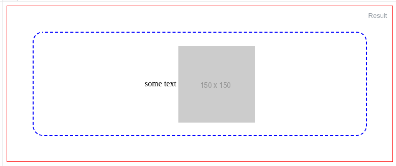
Basically you wrap the image
.outer-frame {
  border: 1px solid red;
  min-height: 200px;
  text-align: center; //only for align horizontally
}

.wrapper{
  line-height: 200px;
  border: 2px dashed blue;
  border-radius: 20px;
  margin: 50px
}

img {
//height: auto;
  vertical-align: middle;
}
<div class="outer-frame">
<div class="wrapper">
some text
<img src="http://via.placeholder.com/150x150">
</div>
</div></div>
Also, you can use Flexbox to achieve the correct result:
.parent {
  align-items: center; /* for vertical align */
  background: red;
  display: flex;
  height: 250px;
  /* justify-content: center; <- for horizontal align */
  width: 250px;
}
<div class="parent">
<img class="child" src="https://cdn2.iconfinder.com/data/icons/social-icons-circular-black/512/stackoverflow-128.png" />
</div></div>
you can use this:
.loaderimage {
position: absolute;
top: 50%;
left: 50%;
width: 60px;
height: 60px;
margin-top: -30px;/*50% of the height*/
margin-left: -30px;
}