jquery特效,以下描述的动画应该怎么做呢?下有详细
我希望做一个动画,就像一张扑克牌一样的效果
点击“切换”按钮,正面以下图的红线为轴翻动,变到背面,然后显示出背面的东西。
请问1、这种动画叫什么动画;2、又该使用什么样的函数或者库才能做到呢?
大家麻烦的花略微指点一下就可以了,希望大家不吝赐教!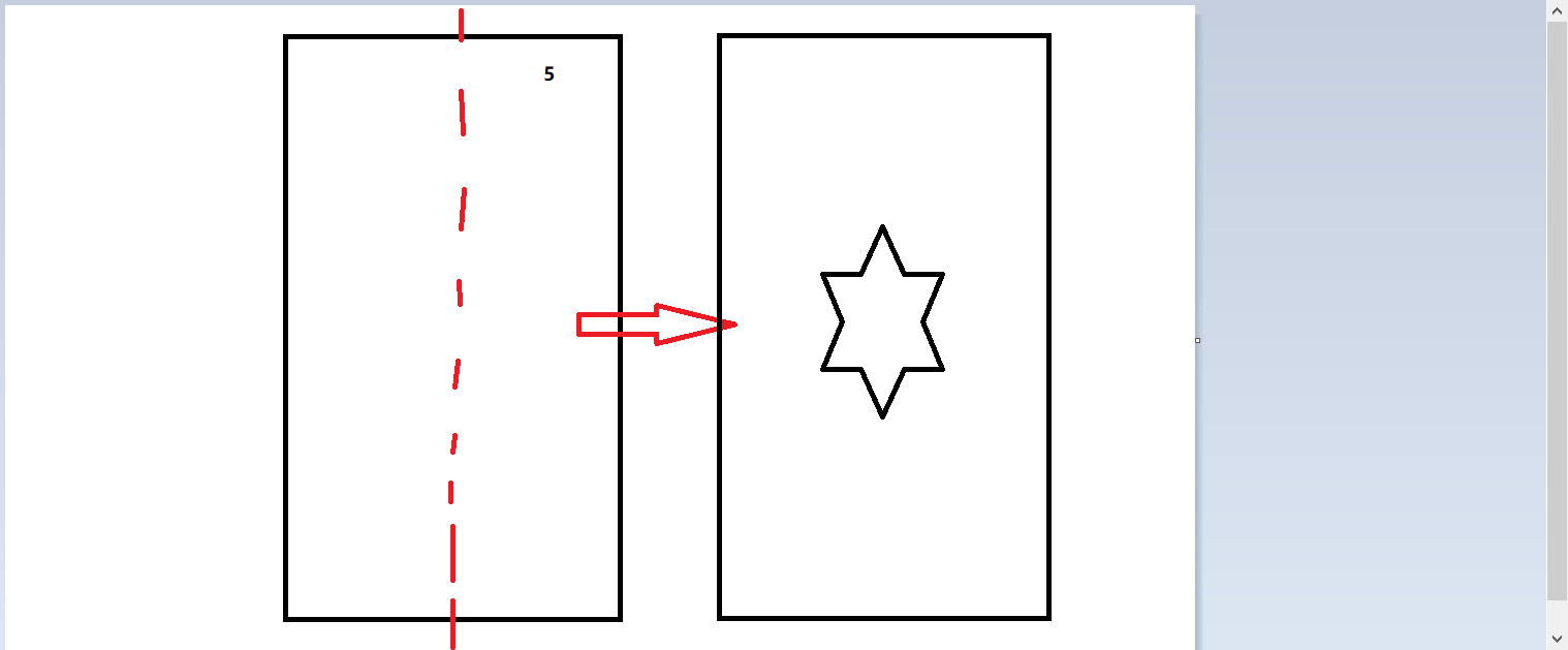
<!doctype html>
<html lang="en">
<head>
    <meta charset="UTF-8" />
    <meta http-equiv="X-UA-Compatible" content="IE=edge,chrome=1" />
    <title> 页面名称 </title>
<style type="text/css">
#box {
    width: 150px;
    height: 250px;
    float: left;
    margin: 10px;
}
#box .front {
    transform: perspective(500px) rotateY(0deg);
    backface-visibility: hidden;
    transition: transform 1s;
    width: 100%;
    height: 100%;
    background-color: #c66;
    margin-right: -100%;
    float: left;
}
#box .backface {
    transform: perspective(500px) rotateY(180deg);
    backface-visibility: hidden;
    transition: transform 1s;
    width: 100%;
    height: 100%;
    background-color: #6CC;
}
#box.hover .front {
    transform: perspective(500px) rotateY(-180deg);
}
#box.hover .backface {
    transform: perspective(500px) rotateY(0deg);
}
</style>
</head>
<body>
<div id="box">
    <div class="front">正面</div>
    <div class="backface">背面</div>
</div>
<input type="button" value="切换" onclick="rotate();" />
<script type="text/javascript">
function rotate() {
    var obj = document.getElementById("box");
    box.className = box.className=="" ? "hover" : "";
}
</script>
</body>
</html>


CSS代码
.in { -webkit-animation-timing-function: ease-out; -webkit-animation-duration: 350ms; animation-timing-function: ease-out; animation-duration: 350ms; } .out { -webkit-animation-timing-function: ease-in; -webkit-animation-duration: 225ms; animation-timing-function: ease-in; animation-duration: 225ms; } .viewport-flip { -webkit-perspective: 1000px; perspective: 1000px; position: absolute; } .flip { -webkit-backface-visibility: hidden; -webkit-transform: translateX(0); /* Needed to work around an iOS 3.1 bug that causes listview thumbs to disappear when -webkit-visibility:hidden is used. */ backface-visibility: hidden; transform: translateX(0); } .flip.out { -webkit-transform: rotateY(-90deg) scale(.9); -webkit-animation-name: flipouttoleft; -webkit-animation-duration: 175ms; transform: rotateY(-90deg) scale(.9); animation-name: flipouttoleft; animation-duration: 175ms; } .flip.in { -webkit-animation-name: flipintoright; -webkit-animation-duration: 225ms; animation-name: flipintoright; animation-duration: 225ms; } @-webkit-keyframes flipouttoleft { from { -webkit-transform: rotateY(0); } to { -webkit-transform: rotateY(-90deg) scale(.9); } } @keyframes flipouttoleft { from { transform: rotateY(0); } to { transform: rotateY(-90deg) scale(.9); } } @-webkit-keyframes flipintoright { from { -webkit-transform: rotateY(90deg) scale(.9); } to { -webkit-transform: rotateY(0); } } @keyframes flipintoright { from { transform: rotateY(90deg) scale(.9); } to { transform: rotateY(0); } } .box { width: 200px; height: 282px; padding-top: 30px; padding-bottom: 30px; margin-left: auto; margin-right: auto; position: relative; } .list { position: absolute; }上述代码中flipintoright和flipouttoleft可根据需要自己定义牌的翻转方向(由左至右 or 由右至左)
JavaScript代码(需要Jquery库)
// 在前面显示的元素,隐藏在后面的元素 var eleBack = null, eleFront = null, // 纸牌元素们 eleList = $(".list"); // 确定前面与后面元素 var funBackOrFront = function() { eleList.each(function() { if ($(this).hasClass("out")) { eleBack = $(this); } else { eleFront = $(this); } }); }; funBackOrFront(); $("#box").bind("click", function() { // 切换的顺序如下 // 1. 当前在前显示的元素翻转90度隐藏, 动画时间225毫秒 // 2. 结束后,之前显示在后面的元素逆向90度翻转显示在前 // 3. 完成翻面效果 eleFront.addClass("out").removeClass("in"); setTimeout(function() { eleBack.addClass("in").removeClass("out"); // 重新确定正反元素 funBackOrFront(); }, 225); return false; });