css怎么给checkbox设置一个红色的边框
css怎么给checkbox设置一个红色的边框,要写个js才行吗?最好纯css
这样就可以了,要用outline而不是border,希望对你有帮助
 .checkBoxRedOutline {
  outline: 1px solid red
}
 <meta charset="utf-8">
<style type="text/css">
form {
  border: 1px solid #ccc;
  padding: 20px;
  width: 300px;
  margin: 30px auto;
}

.wrapper {
  margin-bottom: 10px;
}

.box {
  display: inline-block;
  width: 20px;
  height: 20px;
  margin-right: 10px;
  position: relative;
  border: 2px solid orange;
  vertical-align: middle;
}

.box input {
  opacity: 0;
}

.box span {
  position: absolute;
  top: -10px;
  right: 3px;
  font-size: 30px;
  font-weight: bold;
  font-family: Arial;
  -webkit-transform: rotate(30deg);
  transform: rotate(30deg);
  color: orange;
}

input[type="checkbox"] + span {
  opacity: 0;
}

input[type="checkbox"]:checked + span {
  opacity: 1;
}
</style>

<form action="#">
  <div class="wrapper">
    <div class="box">
      <input type="checkbox" checked="checked" id="username" /><span>√</span>
    </div>
    <label for="username">我是选中状态</label>
  </div>

  <div class="wrapper">
    <div class="box">
      <input type="checkbox"  id="userpwd" /><span>√</span>
    </div>
    <label for="userpwd">我是未选中状态</label>
  </div>
</form>
checkbox{
border:1px solid red;
}
参考这里
https://www.cnblogs.com/chaoyuehedy/p/5586735.html
给CheckBox设置边框border:1px solid red;这样就可以了
border:1px solid red;
input.typeboxclass{
border:2px solid red;
}
你可以换个思路 用图片去代替默认的样式
没办法修改原本的checkbox 的边框, 你可以自己弄一个嘛!反正别人可以看到点就可以了!
没办法修改原本的checkbox 的边框, 你可以自己弄一个嘛!
.radio{
display: inline-block;
input{
    display: none;

    &:checked + span{
        &::before{
            border-color: $blue;
            background-color: $blue;
        }

        &::after{
            opacity: 1;
        }
    }
}

span{
    display: inline-block;
    cursor: pointer;
    padding-left: 25px;
    position: relative;

    &::before{
        width: 18px;
        height: 18px;
        position: absolute;
        top: 0;
        bottom: 0;
        left: 0;
        margin: auto;
        border: 1px solid #666;
        content: '';
        border-radius: 50%;
    }

    &::after{
        content: '';
        width: 18px;
        height: 18px;
        @include position(absolute, 0 null 0 0);
        background: url(../img/radio/check.svg) center no-repeat;
        margin: auto;
        opacity: 0;
        @include transition(opacity 0.2s $ease-out-quad);
    }

    &:hover{
        &::before{
            border-color: $blue;
            background-color: $blue;
        }
    }
}
}
checkbox{
border:1px solid red;
}
在HTML相应位置CheckBox的css样式上,补充边框样式:border:1px solid red;
通常项目运行,页面基本都会有JavaScript内部或者外部链接,也可以在其中给相应的CheckBox位置追加边框样式
如果没有。可以新建js 创建方法加以补充边框样式。
通常各个位置都有样式,如果不想加js补充,可以直接在CSS外部样式堆里找,样式多,找起来比较难,建议用js方法。
<!DOCTYPE HTML>
✔☑
设置图片替换来实现效果
你可以在checkbox外边搞一个表格,然后把表格的边颜色改成红色,就可以了。
你是想要这种效果吧?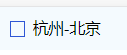
我就是用纯css实现的
实现思路是先将checkbox隐藏,设置成display: none就可以隐藏了
然后给它一个兄弟元素span,将你要的样式设置在span上,伪装成checkbox
最后用label将二者包裹,就可以把checkbox的行为和span的样式改变绑定在一起了
HTML是这样布局的: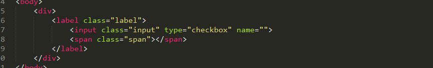
css代码是这样的:其中红线的部分表示选中以后是一个√的形状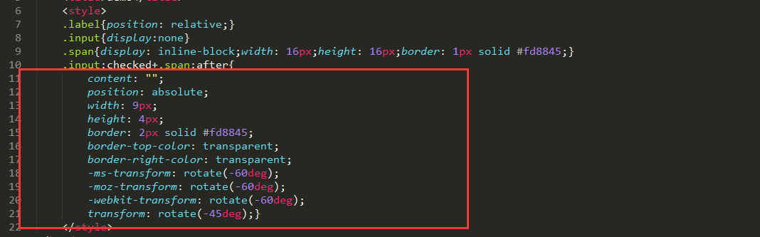
我写了一个demo,直接复制可用:
<!doctype html>
demo
<br> .label{position: relative;}<br> .input{display:none}<br> .span{display: inline-block;width: 16px;height: 16px;border: 1px solid #fd8845;}<br> .input:checked+.span:after{<br> content: "";<br> position: absolute;<br> width: 9px;<br> height: 4px;<br> border: 2px solid #fd8845;<br> border-top-color: transparent;<br> border-right-color: transparent;<br> -ms-transform: rotate(-60deg); <br> -moz-transform: rotate(-60deg); <br> -webkit-transform: rotate(-60deg); <br> transform: rotate(-45deg);}<br>