css实现三列布局(不用css3)
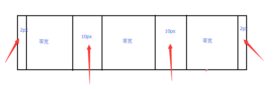
实现如图,间距都是固定的,但是三列实现自适应效果,即三列随屏幕变宽,都是等比增加,但是中间的间距不变。不用css3的flex,用css2实现。
    <div>
        <div style="background: yellow; float: left; width: 33.333%;">
            <div style="margin: 0 6px 0 2px; background: red; "></div>
        </div>

        <div style="background: blue; float: left; width: 33.333%;">
            <div style="margin: 0 4px 0 4px; background: red; "></div>
        </div>

        <div style="background: green; float: left; width: 33.333%; ">
            <div style="margin: 0 2px 0 6px; background: red; "></div>
        </div>
    </div>

        总是把前面的剪了,强迫症不能忍!
用大div去实现不就行了?
把你固定的宽度的写死,其余的写成自动试试。

不是很会前台css,看了之后研究了一下,只是有了个想法。你试试看。