求教,CSS两栏布局,一列固定一列自适应为题
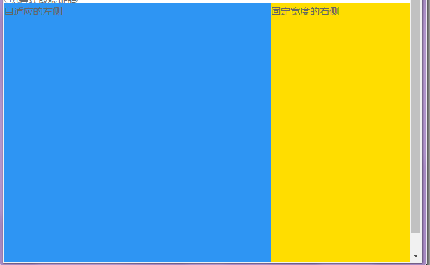
左列为自适应布局没有设宽度,右列设固定宽度,用了float布局,但是发现左右列不在同一行,固定宽度的列被挤到了下方,是什么原因呢?
求大神指教!!!
图片说明](https://img-ask.csdn.net/upload/201703/09/1489043274_3231.png)
许多元素不设宽度就是占整行。
改为向右float,html中先写右列,再写左列。
固定宽度的右侧
自适应的左侧
要先写浮动的div,这样就不会被挤下来了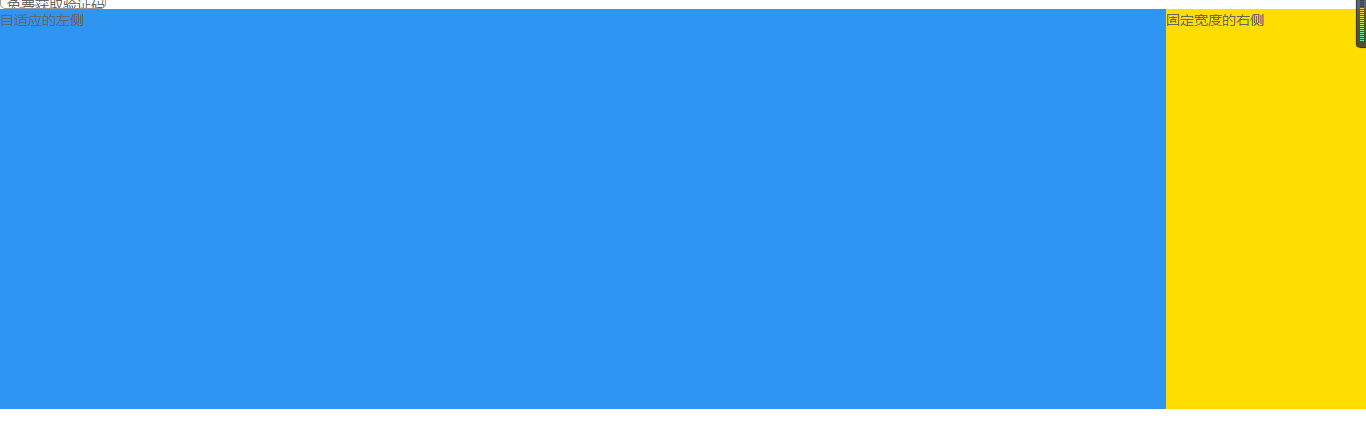
回复中代码太难看,重新贴在这里。
<div style="float:right; width:200px; background-color:red;">right</div>
<div style="background-color:green;">left</div>