网页上鼠标放到上面从边缘弹出的效果怎么做到的
鼠标放上去之前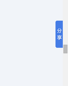
放上去之后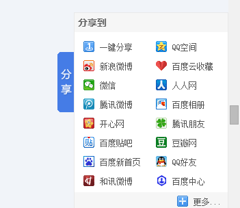
hover设置width就行了。。你要动画可以加上css3
 <style>
    #float{right:0;width:30px;height:100px;top:100px;overflow:hidden;position:fixed;-moz-transition:width 0.6s linear;-webkit-transition:width 0.6s linear;transition:width 0.6s linear;}
    #float div.container{width:10000px;}
    #float div.container div{float:left;height:100%}
    #float div.container div.head{width:30px;background:#eee;line-height:50px;text-align:center}
    #float div.container div.content{width:300px;background:#ccc}
    #float:hover{width:330px}
</style>
<div id="float">
    <div class="container">
        <div class="head">分<br />享</div>
        <div class="content">内容</div>
    </div>
</div>
先隐藏分享内容。当鼠标放到分享图片上时。让分享内容滑动出来。配合JQ很好实现。另外这种网上超多代码。
 <html >
<head>
<meta http-equiv="Content-Type" content="text/html; charset=utf-8" />
<title>css实现层提示</title>
<style>
div{
clear:both;
margin:5px 0 0 0;
font-size:12px;
line-height:22px;
}
a.alt{
position:relative;
background-color:#fff;
float:left;
width:158px;height:20px;
margin:0 auto;
border:1px solid #eee;
text-align:center;
text-decoration:none;
color:#0066cc;
}
a.alt:hover{
background:#fff;
text-decoration:none;z-index:2;
}
a.alt span{
display:none;
}
a.alt:hover span{
position:absolute;
display:block;
top:-1px;left:158px;
width:130px;height:60px;
border:1px solid #eee;
z-index:1;
}
</style>
</head>
<body>
<div></div>
</body>