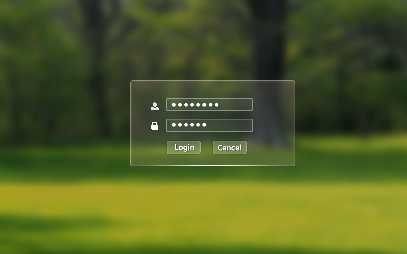
这种水晶边框通过css怎么实现
我也很想知道,之前弄的时候搜过很多,但还是没有弄出来过,做不出自己想要的结果
白色背景,控制透明度,边角radio,就可以了
img随意放张图就能看到效果了
 <!DOCTYPE html>
<html>
    <head>
        <meta charset="UTF-8">
        <title></title>
    </head>
    <style type="text/css">
        div{
            background-color:white;
            opacity: 0.2;
            border-radius: 5px;
            color: white;
            width: 400px;
            height: 300px;
        }
        body{
            background-image: url(img/index.png);
            background-repeat: no-repeat;
            background-size: 100%;
        }
    </style>
    <body>
        <div class="">
            <p>hello world</p>
        </div>
    </body>
</html>
div加个边框。和背景色。边框放上shadow效果。背景色用rgba()。设置颜色和透明度
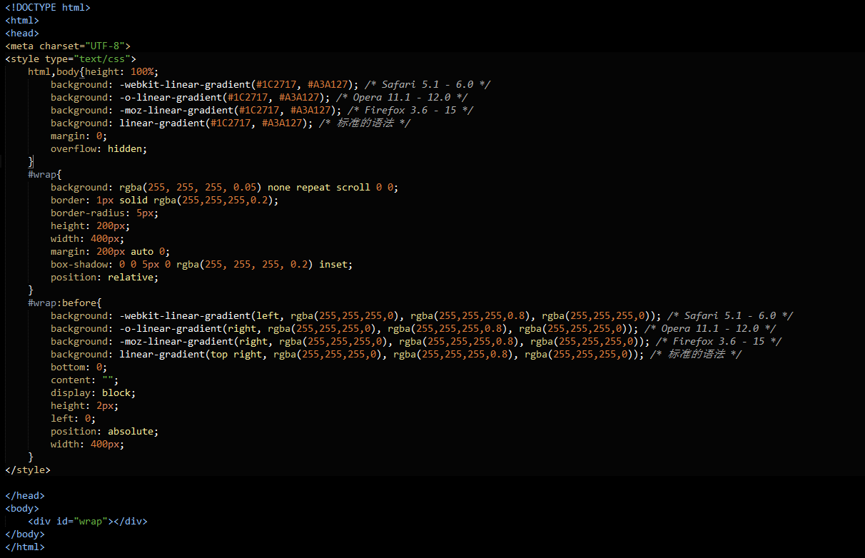
<!DOCTYPE html>
html,body{height: 100%; background: -webkit-linear-gradient(#1C2717, #A3A127); /* Safari 5.1 - 6.0 */ background: -o-linear-gradient(#1C2717, #A3A127); /* Opera 11.1 - 12.0 */ background: -moz-linear-gradient(#1C2717, #A3A127); /* Firefox 3.6 - 15 */ background: linear-gradient(#1C2717, #A3A127); /* 标准的语法 */ margin: 0; overflow: hidden; } #wrap{ background: rgba(255, 255, 255, 0.05) none repeat scroll 0 0; border: 1px solid rgba(255,255,255,0.2); border-radius: 5px; height: 200px; width: 400px; margin: 200px auto 0; box-shadow: 0 0 5px 0 rgba(255, 255, 255, 0.2) inset; position: relative; } #wrap:before{ background: -webkit-linear-gradient(left, rgba(255,255,255,0), rgba(255,255,255,0.8), rgba(255,255,255,0)); /* Safari 5.1 - 6.0 */ background: -o-linear-gradient(right, rgba(255,255,255,0), rgba(255,255,255,0.8), rgba(255,255,255,0)); /* Opera 11.1 - 12.0 */ background: -moz-linear-gradient(right, rgba(255,255,255,0), rgba(255,255,255,0.8), rgba(255,255,255,0)); /* Firefox 3.6 - 15 */ background: linear-gradient(top right, rgba(255,255,255,0), rgba(255,255,255,0.8), rgba(255,255,255,0)); /* 标准的语法 */ bottom: 0; content: ""; display: block; height: 2px; left: 0; position: absolute; width: 400px; }
晕死,第一次发代码,竟然屏蔽了。。。