python的pandas模块画图时中文显示不完全
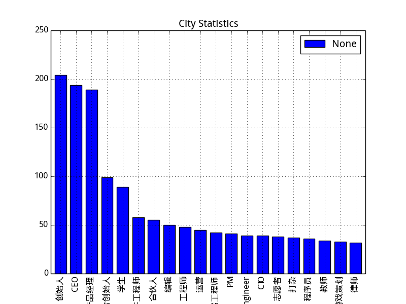
如图,使用pandas分析统计数据时,横轴的职业名称实现不全,太长的放不下,求问解决方案。
     target=pandas.read_csv('zhihu_user_data_30k.csv',encoding='utf-8')
    city_count=target[u'职位'].value_counts()[:20]
    plt=city_count.plot(kind='bar',title="City Statistics").get_figure()
    mplt.legend(loc='best')
    plt.savefig("city.png")
df.plot(kind=chart_type, title=title, fontsize=10, legend=True, rot=10)
调整rot 就可以了, rot=90 垂直显示不完全 , 你们改斜着显示,rot=0, 或10左右就都显示出来了