怎么用css实现图片中的布局
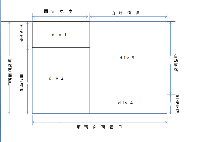
请教, 怎么用css实现图片中的布局, 可以帮忙写一段吗
按%比固定,页面自适应,根据页面大小改变宽高
 <!DOCTYPE html>
<html lang="zh-CN">
<head>

</head>
<body id="body" style="margin: 0px;" onresize="refresh()" onload="refresh()">

<div id="main" style="height: 100%;width: 100%;background-color:#ccc">
    <div id="left" style="float: left; height: 100%; width: 30%; background-color: #255625">
        <div id="top" style="width: 100%; height:30%;background-color: #080808"></div>
        <div id="bottom" style="width: 100%;height:69.9%;  background-color:#ccc"></div>
    </div>

    <div id="right" style="float: left; height: 100%; width:69.9%;background-color: #a94442">
        <div id="right.top" style="width: 100%;height: 69.9%; background-color: #d9edf7"></div>
        <div id="right.bottom" style="width: 100%;height: 30%; background-color: #e4b9c0"></div>
    </div>

</div>

</body>

<script type="text/javascript">
        //onresize() 页面大小改变事件
        //onload()  页面加载完成后的事件
        function refresh() {    //更新页面body的宽度和高度
        var height = document.documentElement.clientHeight; //获取可视面的高度
        var width = document.documentElement.clientWidth;   //获取可视面的宽度

        var body = document.body;
        body.style.height = height + "px";
        body.style.width = width + "px";
    }
</script>
</html>
这个很简单.可以用Table完成!三行三列表格! 第一行第一格合并3行 第二行第二格第二格合并两行,第一行第第一格合并两行!
搞定