html+css新手,大神们能帮看看这个布局怎么搞么
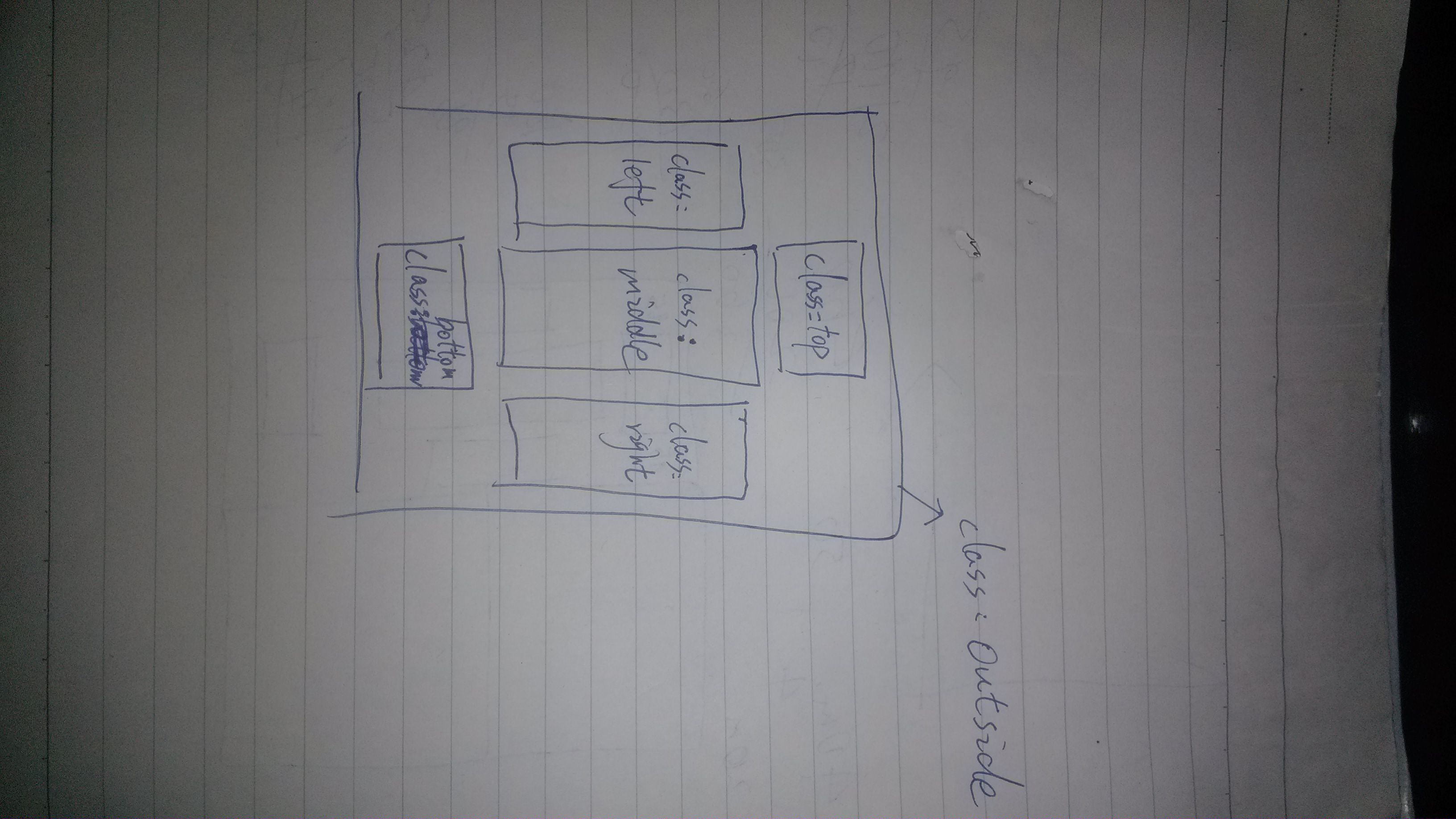
如图,这是我网页布局的草稿,具体应该怎么搞不太明白。能帮帮我么
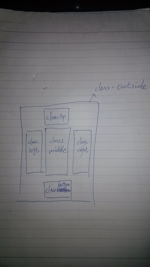
图片转过来啦
上下两个div,一个float是top,一个bottom,中间那个用absolute的postion,自己用JavaScript去控制它的left和top,以及height,它里面套3个div,自己控制宽度
在中间多加一个div用来装中间的三个div
中间三个div用浮动就行了
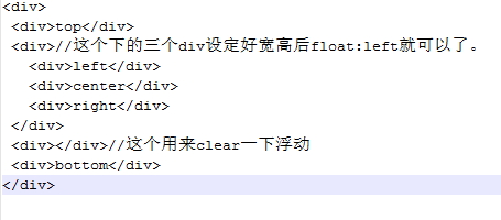
top
//下面的设定好宽高后float:left
left
center
right
clear浮动
bottom
上(top)中下( bottom )各一个盒子( div ),在中间那个盒子中嵌套三个盒子浮动摆放
<!DOCTYPE html PUBLIC "-//W3C//DTD XHTML 1.0 Transitional//EN" "http://www.w3.org/TR/xhtml1/DTD/xhtml1-transitional.dtd">
布局
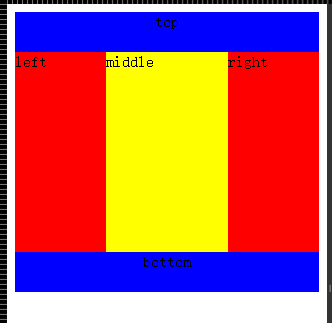
<br> body{width:auto;height:auto;margin:0px;padding:0px;}<br> .demo{width:1200px;margin:0 auto;padding:0px;}<br> .top{width:1200px;height:100px;overflow:hidden;margin:0 auto;padding:0px;background:#ccc;}<br> .left{width:390px;float:left;height:200px;margin:10px 10px 10px 0;background:blue;}<br> .middle{width:390px;float:left;height:200px;margin:10px 10px 0 0;background:red;}<br> .right{width:390px;float:left;height:200px;margin:10px 10px 0 0;background:yellow;}<br> .bottom{width:1200px;height:100px;overflow:hidden;margin:10px auto;padding:0px;background:#eeeeee;}<br>
top
left
middle
right
bottom
float布局而已
<!DOCTYPE html>
<style>
    #wrapper{width:900px;margin:0px auto}
    #content{zoom:1;overflow:hidden}
    #left,#middle,#right{margin-left:10px;height:500px;float:left}
    #left,#right{width:200px}
    #right{float:right}
    #left{margin-left:0px}
    #middle{width:450px}
</style>
<div id="wrapper">
<div id="top">top</div>
<div id="content">
<div id="left">left</div>
<div id="middle">middle</div>
<div id="right">right</div>
</div>
<div id="bottom">bottom</div>
</div>
 <!DOCTYPE html>
<style>
    #wrapper{width:900px;margin:0px auto}
    #content{zoom:1;overflow:hidden}
    #left,#middle,#right{margin-left:10px;height:500px;float:left}
    #left,#right{width:200px}
    #right{float:right}
    #left{margin-left:0px}
    #middle{width:450px}
</style>
<div id="wrapper">
<div id="top">top</div>
<div id="content">
<div id="left">left</div>
<div id="middle">middle</div>
<div id="right">right</div>
</div>
<div id="bottom">bottom</div>
</div>
布局设计,很多教程的。
上面div 设置宽度,,margin:0 auto,居中显示
中间三个设置宽度,float:left;一字排开
下面div 设置宽度,,margin:0 auto,居中显示
 <!DOCTYPE html>
<html>
    <head>
        <title>多栏布局</title>
        <meta charset="UTF-8">
        <meta name="viewport" content="width=device-width, initial-scale=1.0">
    </head>
    <body>
        <div class="top" style="height: 40px; text-align: center; background-color: blue;">top</div>
        <div style="display: flex;display:-webkit-flex;display:-webkit-box;">
            <div  class="left" style="height: 200px; background-color:red; width: 30%;">left</div>
            <div class="middle" style="height: 200px; background-color:yellow; width: 40%;">middle</div>
            <div class="right" style="height: 200px; background-color:red; width: 30%;">right</div>
        </div>
        <div class="bottom" style="height: 40px; text-align: center; background-color: blue;">bottom</div>
    </body>
</html>