三列布局,左右固定,中间自适应?
 <style>
body{ margin:0; padding:0; font-size:30px; font-weight:bold}
.header{height: 100px;background: #777;}
.content{height:700px;background: #000;}
.left{ width:240px; height:600px; background:#ccc; position:absolute; left:0; top:100}
.main{ height:600px; margin:0 240px; background:#9CF}
.right{ height:600px; width:240px; position:absolute; top:100; right:0; background:#FCC;}
</style>
</head>

<body>
    <div class="header"></div>
        <div class="content">
            <div class="left">left</div>
            <div class="main">main</div>
            <div class="right">right</div>
        </div>
</body>
很简单的三列布局,为什么给右边栏会浮动到下面去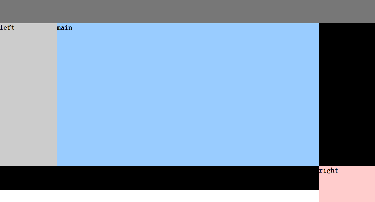
left和right的css添加top:100px,要不没设置top时,紧跟上一个容器的位置进行定位
.left {
width: 240px;
height: 600px;
background: #ccc;
position: absolute;
left: 0px;
top: 0px;
}
    .main {
        height: 600px;
        margin: 0 250px;
        background: #9CF
    }

    .right {
        height: 600px;
        width: 240px;
        position: absolute;
        top: 0px;
        right: 0px;
        background: #FCC;
    }
            将top:0 -----> top:0px