css用圣杯布局,顶部设置position:fixed后,下拉时两侧会拖动?
html部分:
css部分:
*{
margin: 0;
padding: 0;
}
ul{
list-style: none;
}
nav{
height: 60px;
background-color: #0f9aeb;
width: 100%;
position: fixed;
top: 0;
left: 0;
text-align: center;
}
.header{
margin: 0 auto;
width: 1160px;
}
.menu{
display: flex;
justify-content: left;
height: 40px;
margin-top: 20px;
}
.menu .headicon{
background-image: url("C:/Users/ASUS/Desktop/WIS(1)/wis.png");
background-repeat: no-repeat;
background-size: 100px;
background-position: center;
width: 100px;
height: 43px;
margin-top: -3px;
}
.menu>li{
margin-left: 10px;
}
a{
text-decoration: none;
color: #fff;
display: block;
padding: 10px 15px;
font-size: 16px;
transition: background-color 0.5s ease-in-out;
}
a:hover{
background-color: #1eaeda;
}
.kind li{
opacity: 0;
transform-origin: top center;
}
.kind li a{
background-color: #0f9aeb;
padding: 10px 0;
}
/* 男士动画 /
.menu li:hover .menu1 li:first-of-type{
animation: change1 0.3s ease-in-out forwards;
animation-delay: 0.3s;
}
.menu li:hover .menu1 li:nth-of-type(2){
animation: change1 0.3s ease-in-out forwards;
animation-delay: 0.6s;
}
.menu li:hover .menu1 li:nth-of-type(3){
animation: change1 0.3s ease-in-out forwards;
animation-delay: 0.9s;
}
.menu li:hover .menu1 li:last-of-type{
animation: change1 0.3s ease-in-out forwards;
animation-delay: 1.2s;
}
@keyframes change1{
0%{
opacity: 0;
transform: translateX(50px) rotate(-90deg);
}
100%{
opacity: 1;
transform: translateX(0) rotate(0);
}
}
/ 女士动画 /
.menu li:hover .menu2 li:first-of-type{
animation: change2 0.3s ease-in-out forwards;
animation-delay: 0.2s;
}
.menu li:hover .menu2 li:nth-of-type(2){
animation: change2 0.3s ease-in-out forwards;
animation-delay: 0.4s;
}
.menu li:hover .menu2 li:nth-of-type(3){
animation: change2 0.3s ease-in-out forwards;
animation-delay: 0.6s;
}
.menu li:hover .menu2 li:last-of-type{
animation: change2 0.3s ease-in-out forwards;
animation-delay: 0.8s;
}
@keyframes change2{
0%{
opacity: 0;
transform: scale(2);
}
100%{
opacity: 1;
transform: scale(1);
}
}
/ 套装动画 /
.menu li:hover .menu3 li:first-of-type{
animation:change3 0.3s ease-in-out forwards;
animation-delay: 0.3s;
}
.menu li:hover .menu3 li:nth-of-type(2){
animation:change3 0.3s ease-in-out forwards;
animation-delay: 0.6s;
}
.menu li:hover .menu3 li:nth-of-type(3){
animation:change3 0.3s ease-in-out forwards;
animation-delay: 0.9s;
}
.menu li:hover .menu3 li:last-of-type{
animation:change3 0.3s ease-in-out forwards;
animation-delay: 1.2s;
}
@keyframes change3{
0%{
opacity: 0;
transform: translatex(50px) rotate(-90deg);
}
100%{
opacity: 1;
transform: translatex(0) rotate(0);
}
}
/ 社区动画 */
.menu li:hover .menu4 li:first-of-type{
animation: change4 0.3s ease-in-out forwards;
animation-delay: 0.2s;
}
.menu li:hover .menu4 li:nth-of-type(2){
animation: change4 0.3s ease-in-out forwards;
animation-delay: 0.4s;
}
.menu li:hover .menu4 li:nth-of-type(3){
animation: change4 0.3s ease-in-out forwards;
animation-delay: 0.6s;
}
.menu li:hover .menu4 li:last-of-type{
animation: change4 0.3s ease-in-out forwards;
animation-delay: 0.8s;
}
@keyframes change4{
0%{
opacity: 0;
transform: scale(2);
}
100%{
opacity: 1;
transform: scale(1);
}
}
/***************** main部分************************* */
.main{
overflow: hidden;
margin-top: 60px;
padding: 0 150px;
}
.left,.content,.right{
float: left;
min-height: 700px;
position: relative;
height: auto!important;
}
.left{
margin-left: -100%;
width: 150px;
background-color: rgb(200, 202, 202);
left: -150px;
}
.content{
width: 100%;
}
.right{
margin-left: -150px;
right: -150px;
width: 150px;
background-color: rgb(200, 202, 202);
}
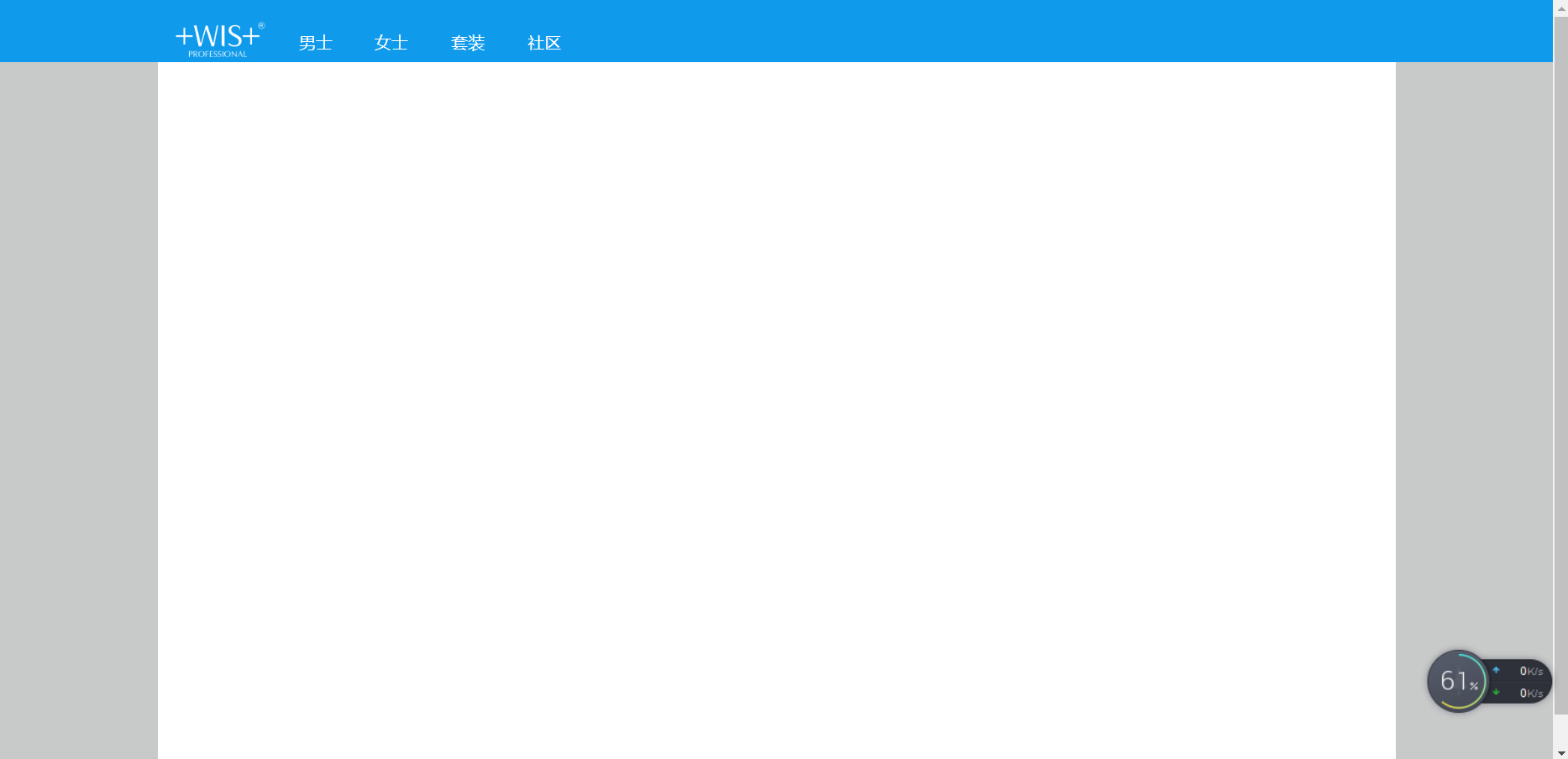
我刚写的一个页面和你这布局一样的,你可以看一下对你有没有帮助,代码也全部都在顶部多层导航