如何在2列中添加li元素[重复]
This question already has an answer here:
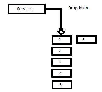
Good day guys i just want to ask if how can i achieve the picture that i attach so far i did it automatically like this on PHP.
function bootstrap_menu($array, $parent_id = 0, $parents = array())
{
    if($parent_id == 0) {
        foreach ($array as $element) {
            if (($element['parent_id'] != 0) && !in_array($element['parent_id'],$parents)) {
                $parents[] = $element['parent_id'];
            }
        }
    }

    $menu_html = '';

    foreach($array as $element) {
        if($element['parent_id'] == $parent_id) {
            if(in_array($element['id'], $parents)) {
                $menu_html .= '<li class="has-dropdown">';
                $menu_html .= '<a href="'.$element['url'].'" class="dropdown-toggle" role="button" aria-expanded="false">'.$element['title'].'</a>';
            } else {
                $menu_html .= '<li>';
                $menu_html .= '<a href="' . $element['url'] . '">' . $element['title'] . '</a>';
            }

            if(in_array($element['id'], $parents)) {
                $menu_html .= '<ul class="dropdown" style="display: none;">';
                $menu_html .= $this->bootstrap_menu($array, $element['id'], $parents);
                $menu_html .= '</ul>';
            }

            $menu_html .= '</li>';
        }
    }

    return $menu_html;
}
How can i make that possible guys. Do i need to add a counter for the li element?
</div>
Your issue here is actually a CSS related issue rather than a PHP issue. If you are using a browser that supports flexbox then this issue becomes trivial.
Here is a good example, and resource for flexbox in general, that solves your issue
EDIT: Let me try that again! The issue here does not stem from your PHP at all. Your PHP is working just as you intend it! The issue is that in order for your images to be displayed the way you want, you are going to need to style them with CSS to make the conform to how you want them to look
The links that I provide discuss some CSS properties that will make this job simple. The properties specifically are the
display: flex
flex-direction: column
flex-wrap: wrap
How much do you know about CSS and its properties? The menu that contains your images should receive these properties. By setting the display to flex, it tells the browser what kind of "box" the element will have if you are familiar with the CSS box-model.
Setting the direction to column will result in each element stacking directly below one another, like what you would expect if an element had display set to block, like one of these elements
<div>
<p>
The wrap property tells the container that its elements should not overflow the container, but rather, when the entire space of the height of the container is filled, it should create a new column that sits directly beside the first, resulting in the image you see in the previous link I posted about solving your issue.
Is this more clear?